
FEB 2024 - JUL 2024
Redesigning an eCommerce mobile app's usability, branding, and immersive customer experience.
PROJECT OVERVIEW
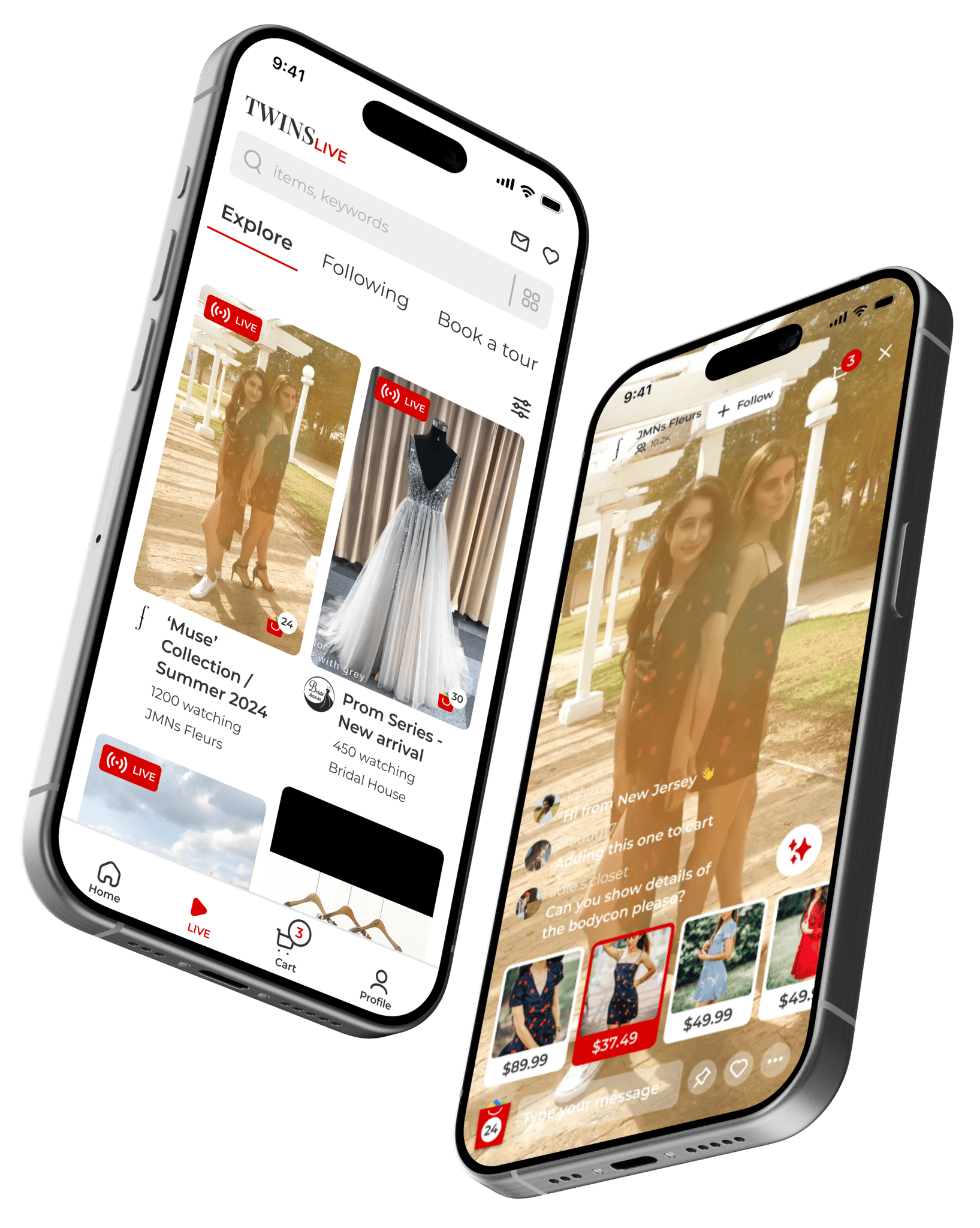
TWINS is an augmented reality eCommerce mobile app designed specifically for customers who often struggle with decision making when shopping online.
CLIENT
TWINS
ROLE
UX Research
UX Design
UX Writing
UI Design
Visual & Branding
CONTRIBUTION AND IMPACT
Designed an entire new feature as potential solution for the app
Redesigned three MVP flows from end-to-end
Redesigned TWINS brand identity and style guide
Accelerate 2 rounds of usability testing with insights from user interviews and observational research
THE CONTEXT
I was approached by TWINS to redesign their mobile app's Onboarding, Browsing and Checkout experience to greatly improve their app's usability and the conversion from browse to completion of checkout.
In addition, TWINS would like a light refresh of their visual identity to ensure that their mobile experience feels modern and trustworthy, while still adhering to their established brand guidelines.

THE PROBLEM
Product research has hypothetically proposed that users are unable to determine which items are best for their purchase based on relative features, as well as having frustration over required account registration/login at checkout. As a result, customers abandon their entire mobile shopping experience after hours of browsing.
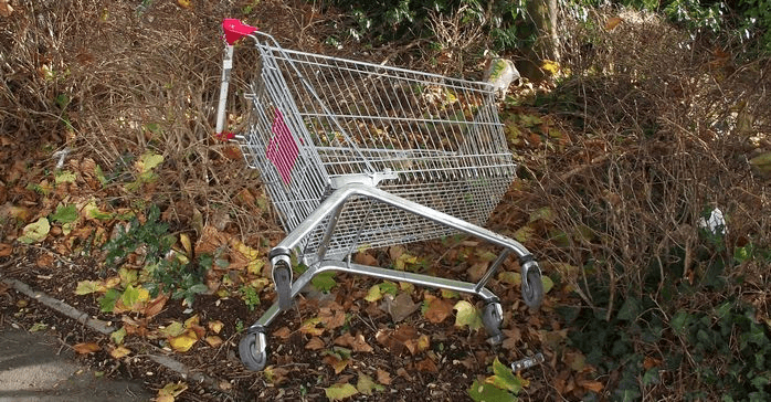
To be specific, insights from the Product Manager reveal that 50% of users view on average more than 30 different items then abandon the app without moving any items into cart. Additionally, 70% of users who place an item in the cart do not purchase. Data shows that users abandon the cart at the registration screen.
THE OBJECTIVE
Design an immersive online shopping experience that goes beyond just usability: a happy path to help customers make certain purchasing decisions in which they minimize the chance of regretting later, resulting in increasing the business conversion rate, user retention rate, and brand trust.
THE SOLUTION
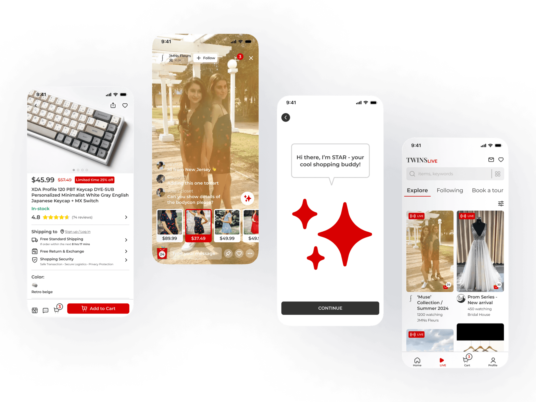
INTRODUCING TWINS LIVE
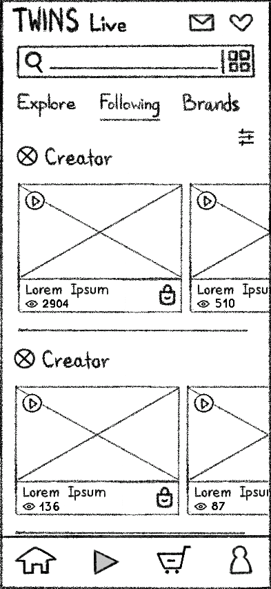
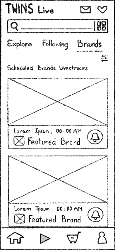
TWINS Live is a newly proposed feature that enables real-time streaming of products. By focusing on livestreaming and short-form video recording technologies, the feature offers customers a live-shopping experience where they can view or share products in a more precise and interactive way.
KEY FUNCTIONALITIES
1
Engaging live chat and Q&As that allow direct communication between users
2
Featured items can be browsed, compared and purchased directly from ongoing livestream
and while most existing solutions provide a positive outcome,
what makes TWINS Live unique
is
3
24/7 AI assistant that autonomously personalizes your shopping experience with the ability to: consult your considerations, shop on your behalf, and create your AR shopping personas
THE PROCESS
DISCOVER
DEFINE
DEVELOP

ITERATE
ITERATE
MEASURABLE
RESULT
AWARENESS
IMPACT
DISCOVER
DEFINE
DEVELOP
DELIVER
DISCOVER
COMPETITOR ANALYSIS
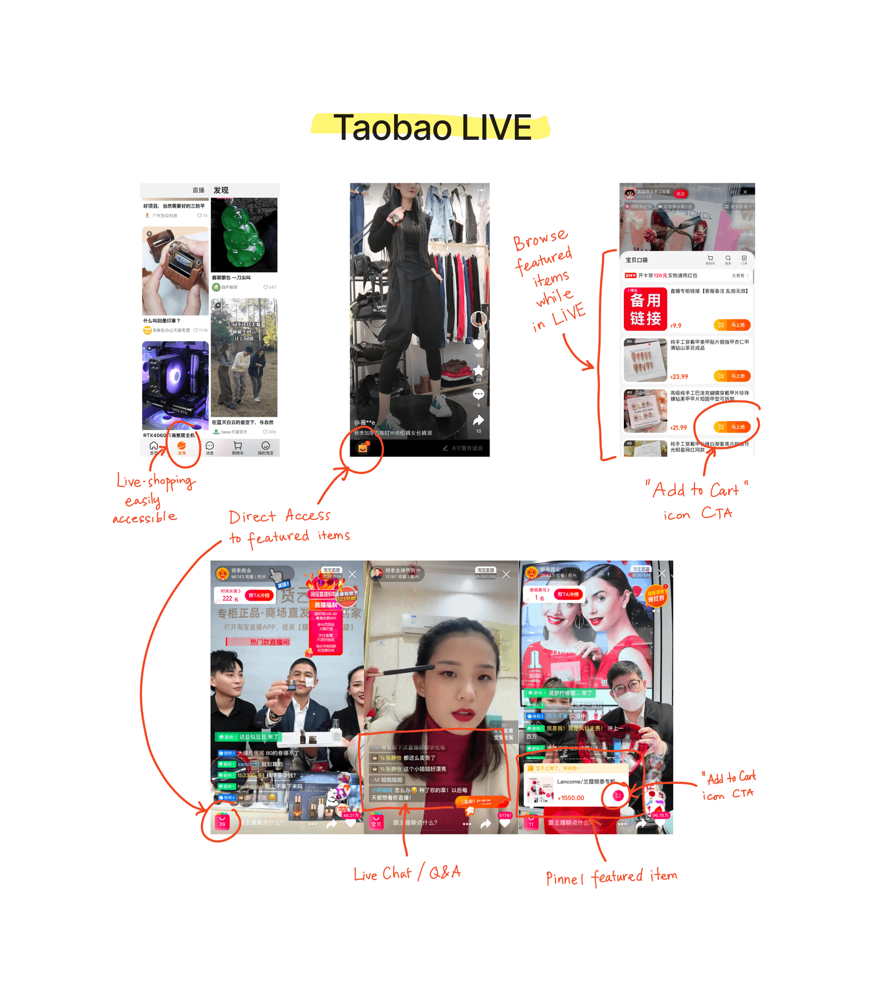
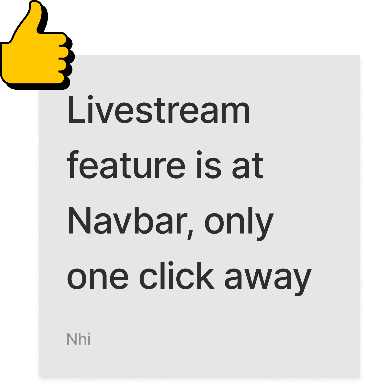
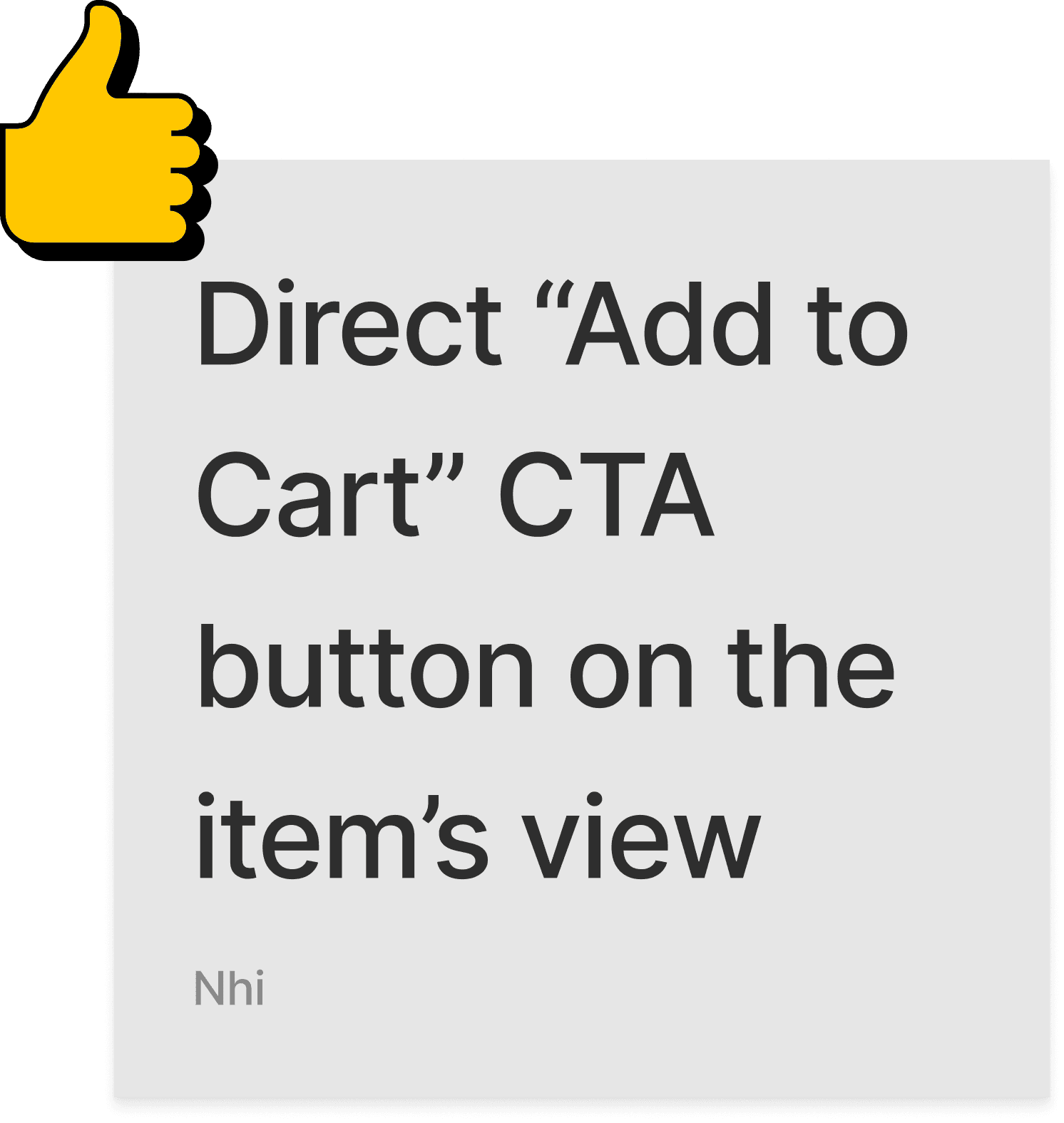
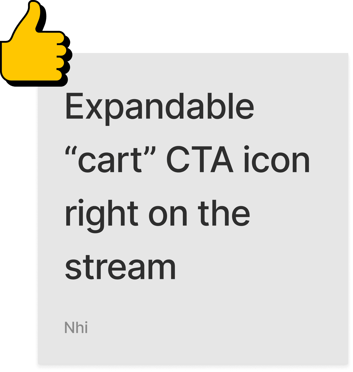
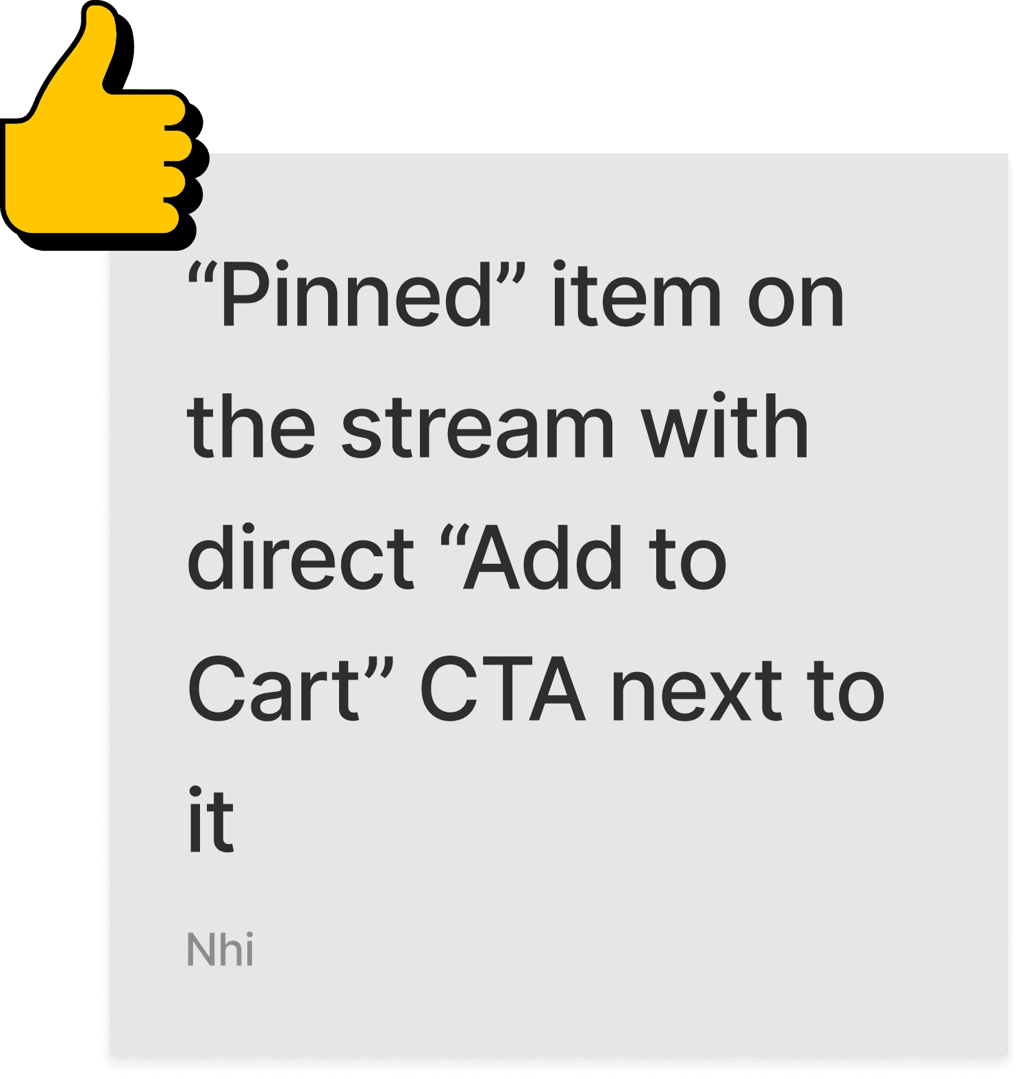
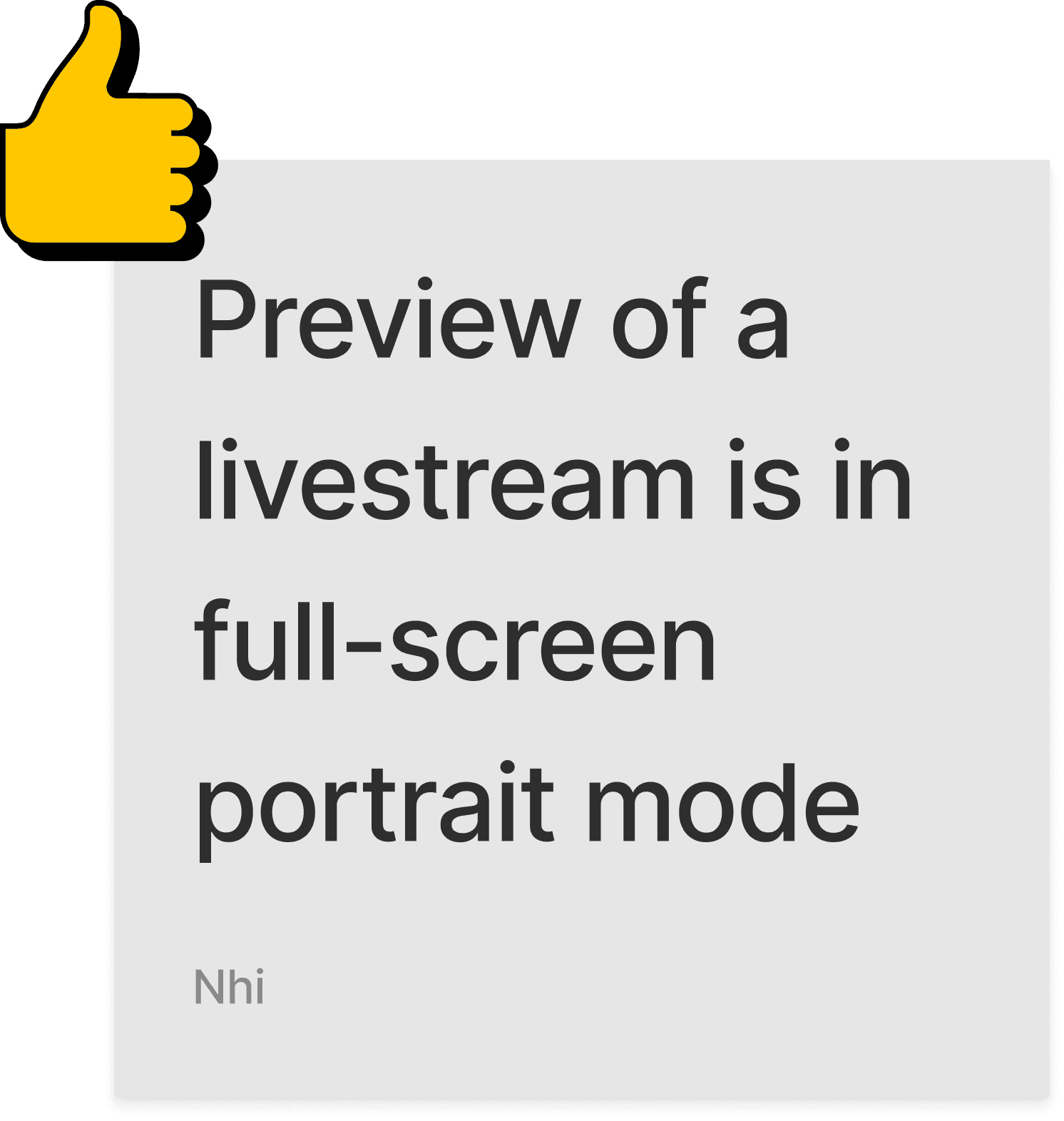
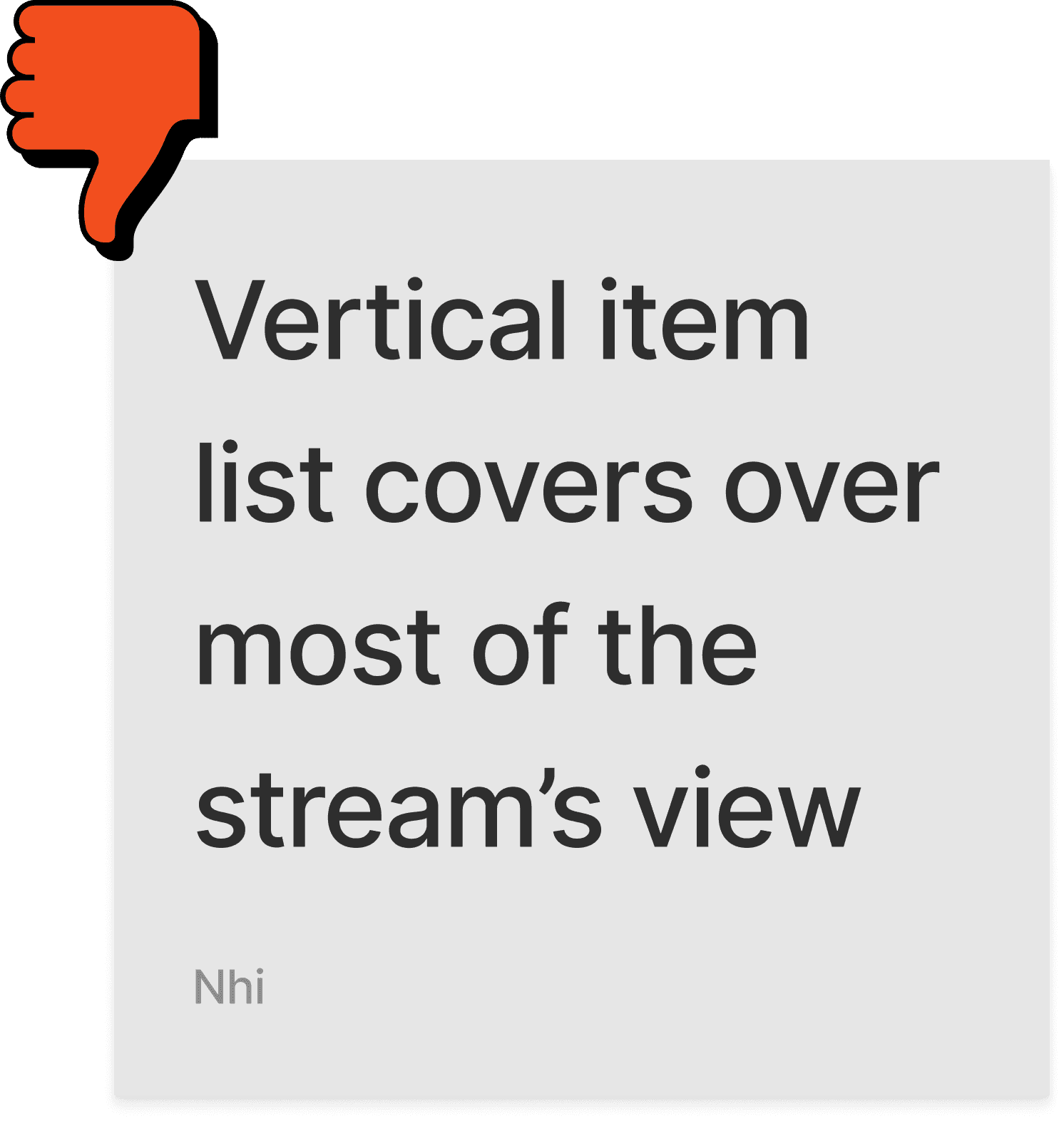
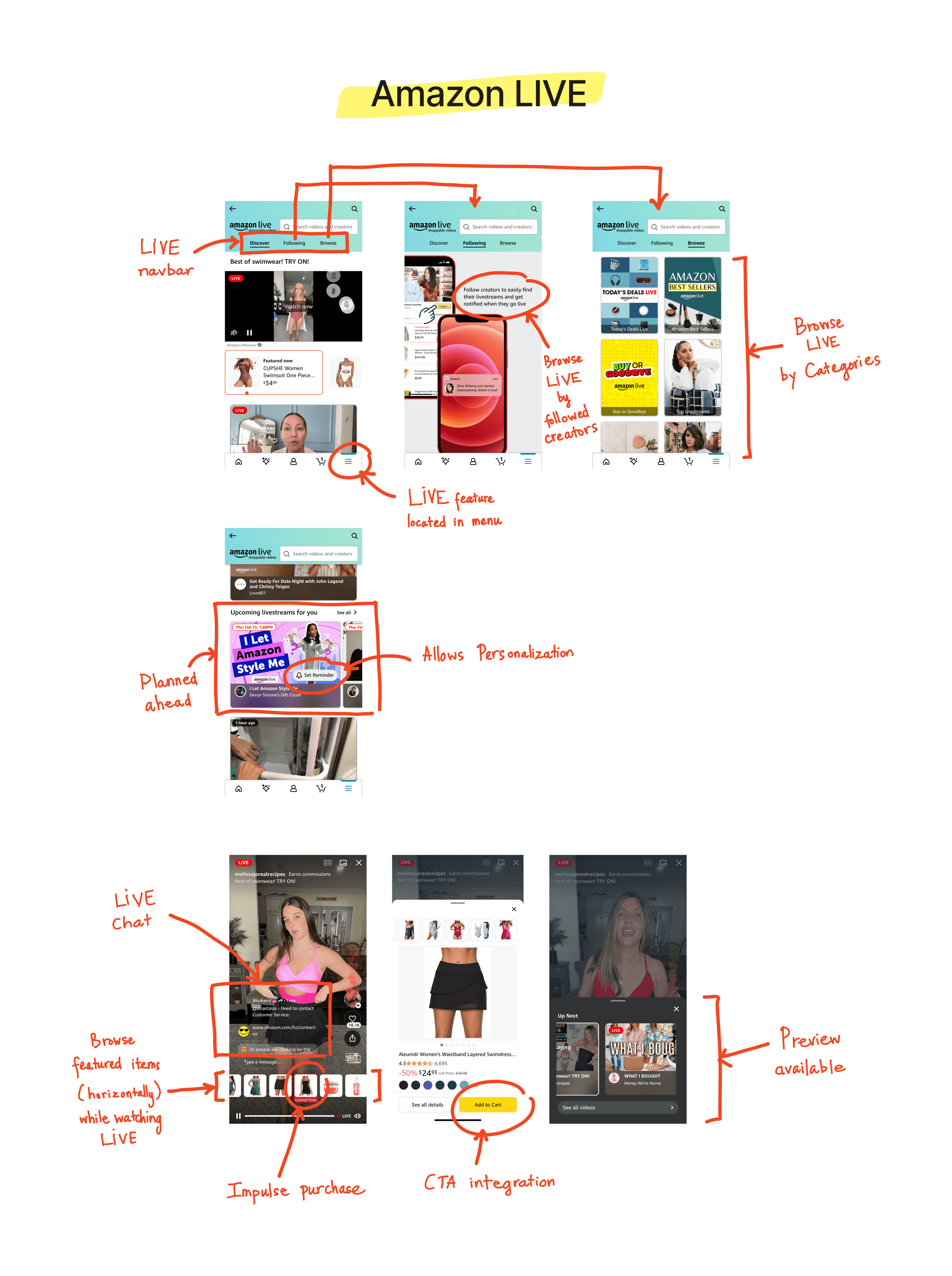
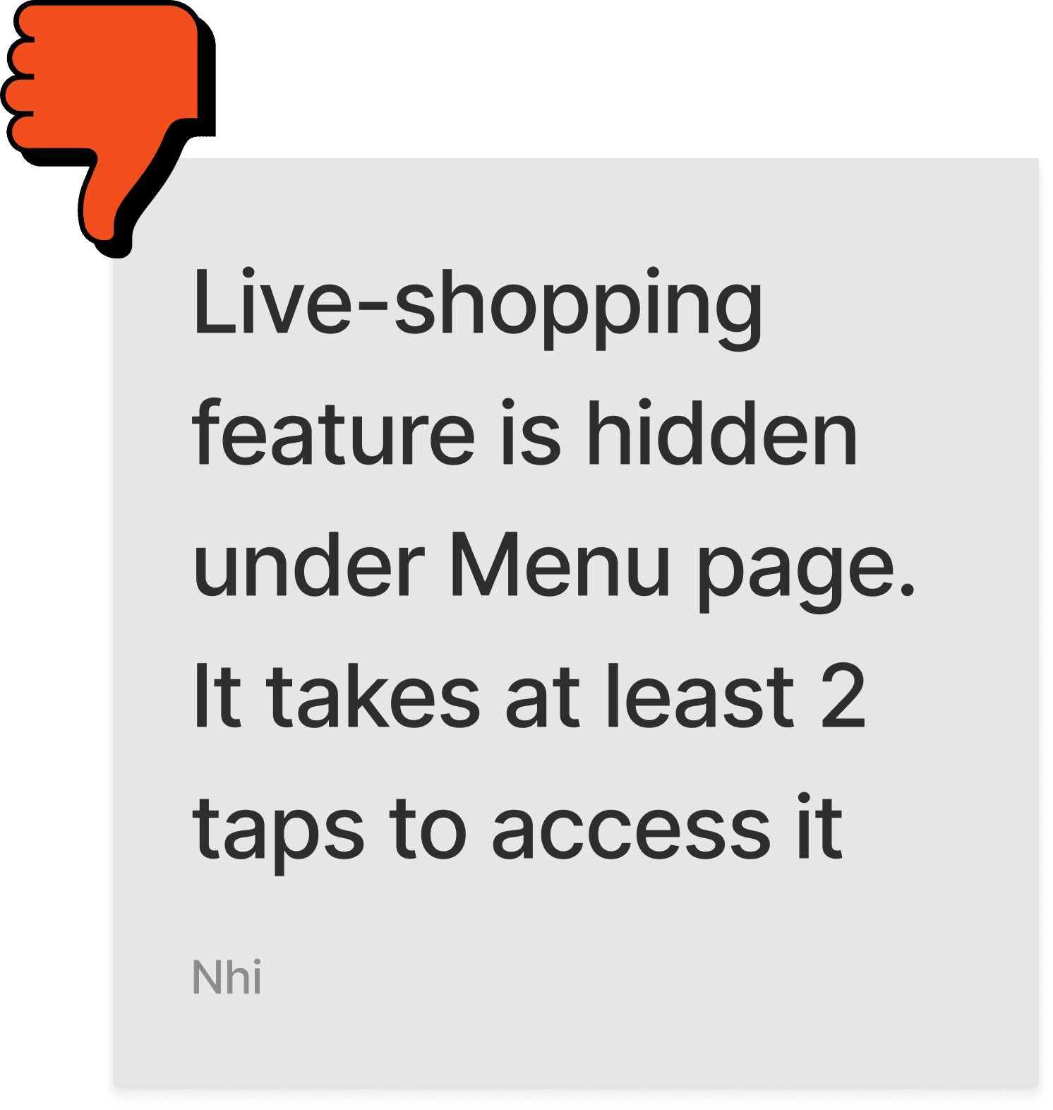
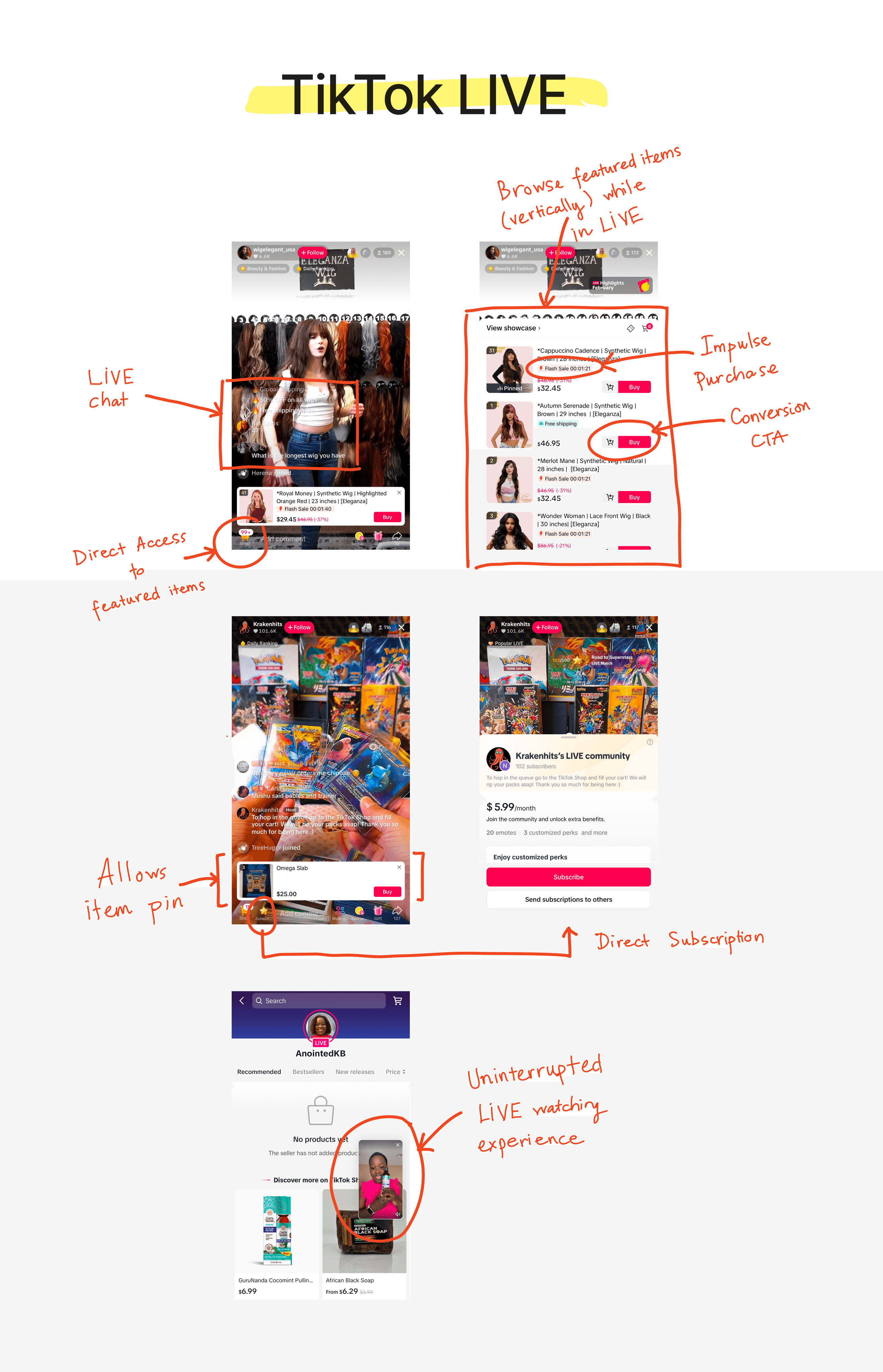
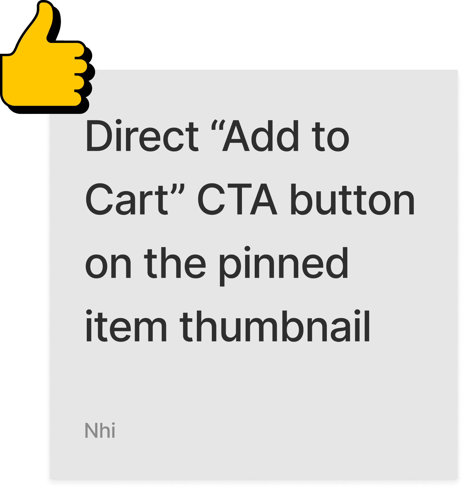
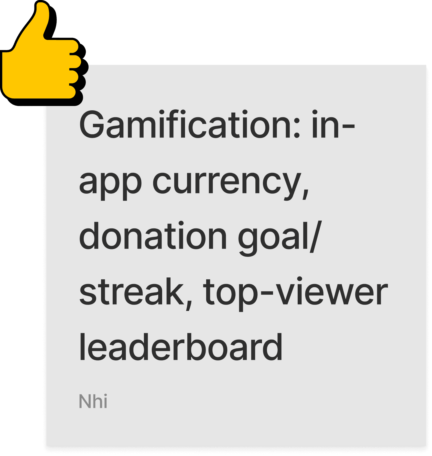
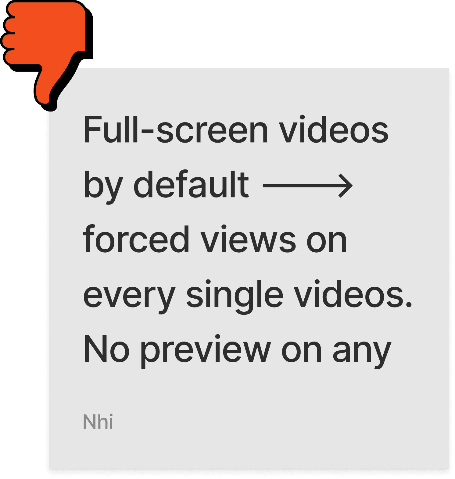
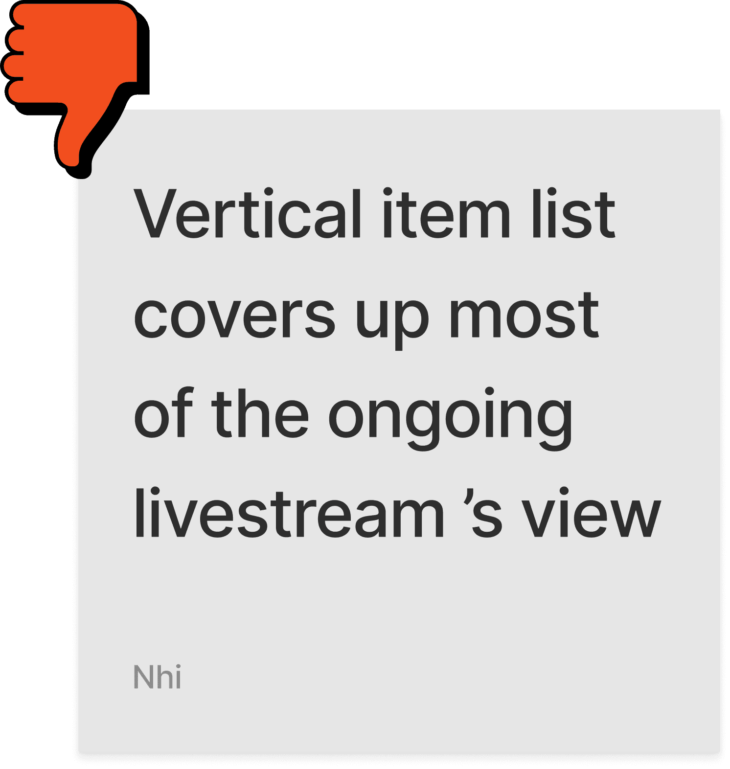
I first analyzed existing solutions on the market by evaluating the user experience of three leading eCommerce platforms: Taobao, Amazon, and TikTok.
Starting off looking at how competitors encourage live-shopping activities to adjust customer decision making issues is my way to target specific problem spaces without spreading time on other areas.





SECONDARY RESEARCH
I chose to conduct secondary research by reading and analyzing 7 academic studies that explained on the thought process of online shoppers that could possibly lead them to certain decision makings, and also measured how effective live-shopping experience would be in this matter.
The research would also help me answer these following questions:
What are the most common behaviors that online shoppers typically perform before and after the moment they abandon a shopping experience?
What causes shoppers to abandon their shopping cart?
What factors can possibly affect a user's decision making process?
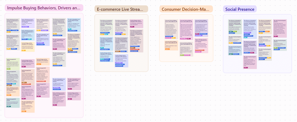
Highlighted notes and tags affinitized into themes
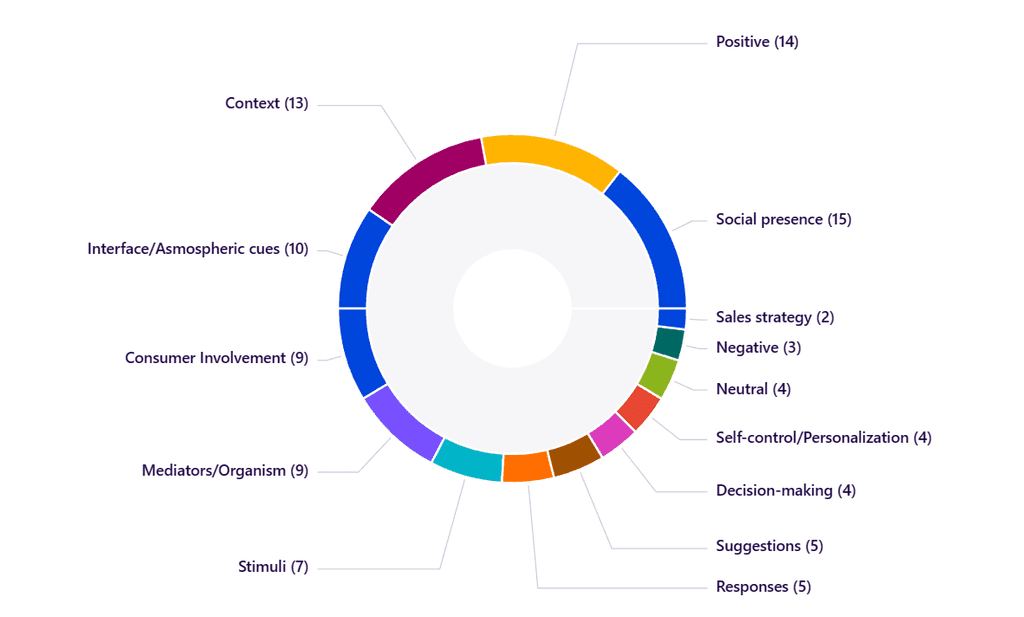
Quantitative visualization of my qualitative highlights to uncover new themes and patterns
DATA SYNTHESIS
The research insights reveal that around 70-80% of online shoppers are more likely to end up with a wishlist of items after a traditional shopping session, rather than placing an order right away. From here, conversion rate could result in slow mode due to delayed purchases, or in none (abandoned carts). However, with live-shopping instances, users seem to know what they want precisely, fostering confidence in making decisions.
To synthesize my research insights into actionable themes, I created an affinity map where I explored the correlation/causation between major themes of all the papers: Mediators, Stimuli, Responses, and Moderation in regards with online shopping experiences. Accordingly, people could approach a question in their mind with multiple ways of finding the answers, but 8 styles of decision making have been most commonly observed.
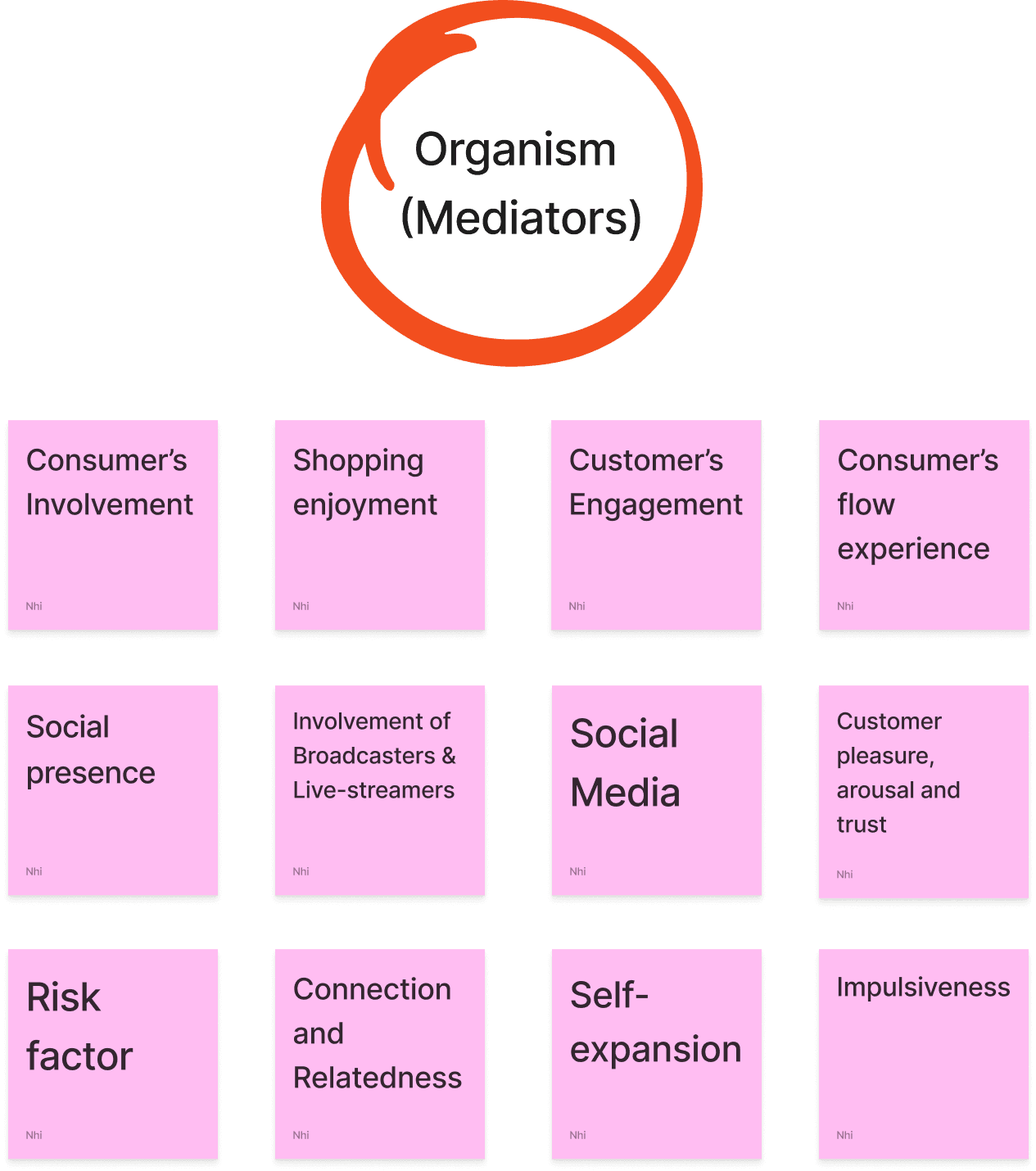

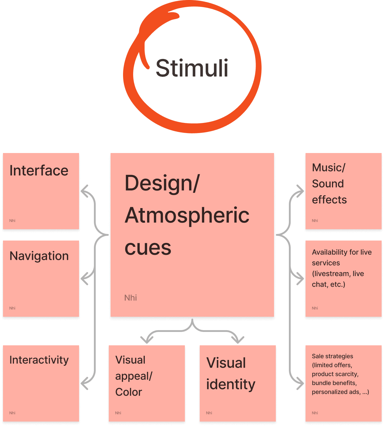
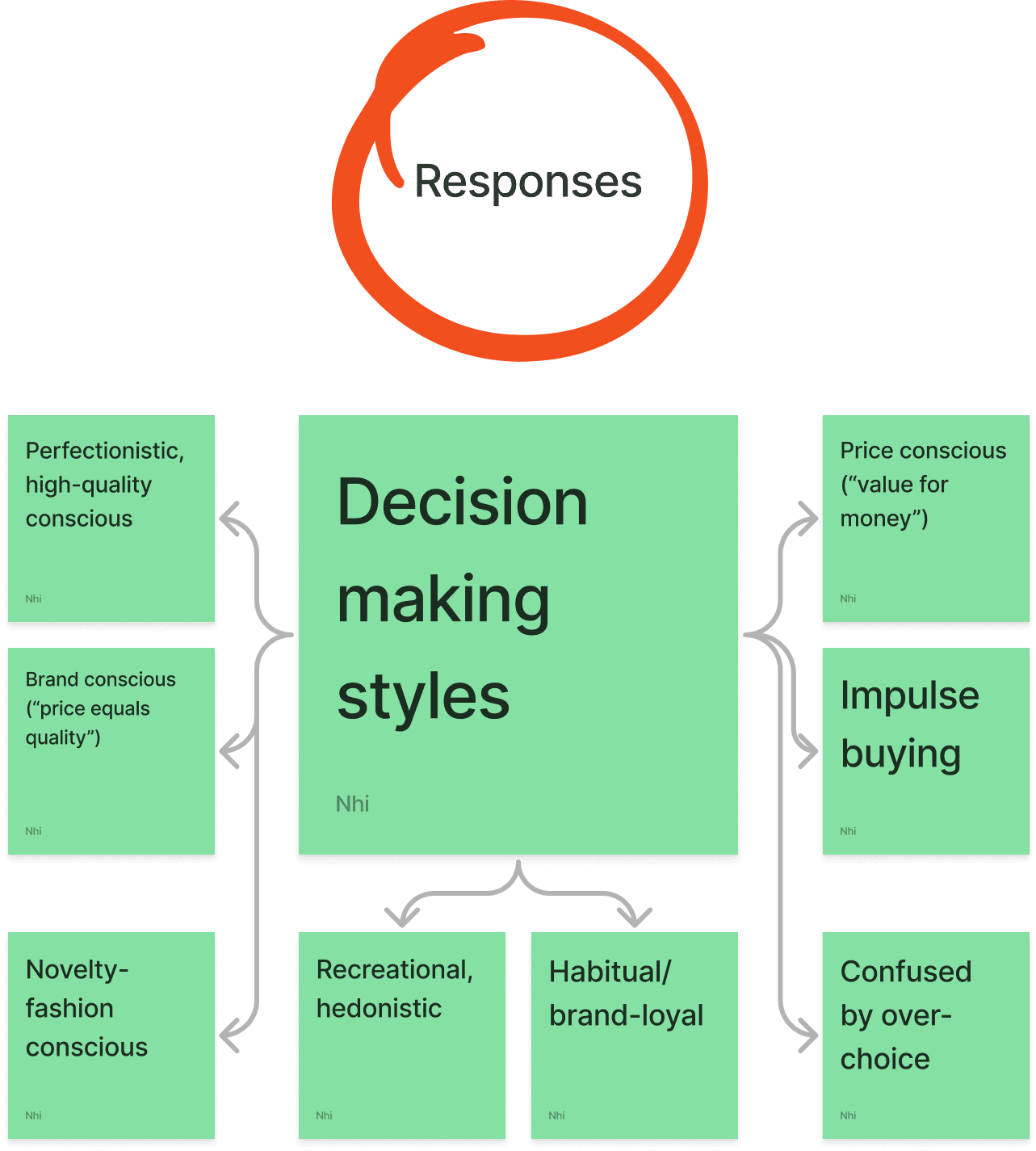


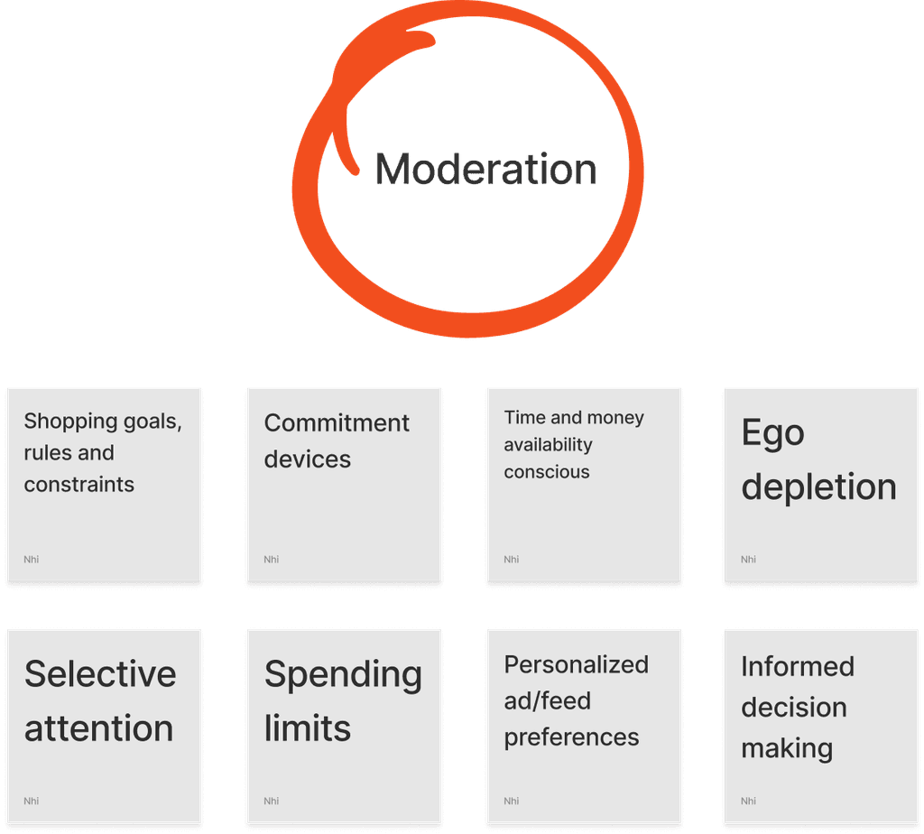
Based on the second research insights, I learned that although there are multiple psychological paths of decision making a user could possibly go through to achieve their shopping goals, ultimately, most users desire in expressing their social presence. Some might take a number of steps and not just stick to a particular way, while some might present certain shopping patterns chronically.
Key takeaways
Serious users want more ways to better express themselves and their values (brands, styles, etc.) in their growing community, not just all about profitability.
It is critical to provide users a sense of reassurance or validation, so that they feel more confident with the choices they have already made.

DEFINE
USER FLOWS
The discovery phase helped me shape profound directions for TWINS early concept redesign. I decided to create two types of user flows (Buyers vs Sellers), each with three critical MVP routes that might address mentioned issues of the app, as well as to establish a foundation for TWINS Live.
Given the timeframe of this project, the buyer's flow would still act as the mega MVP flow.
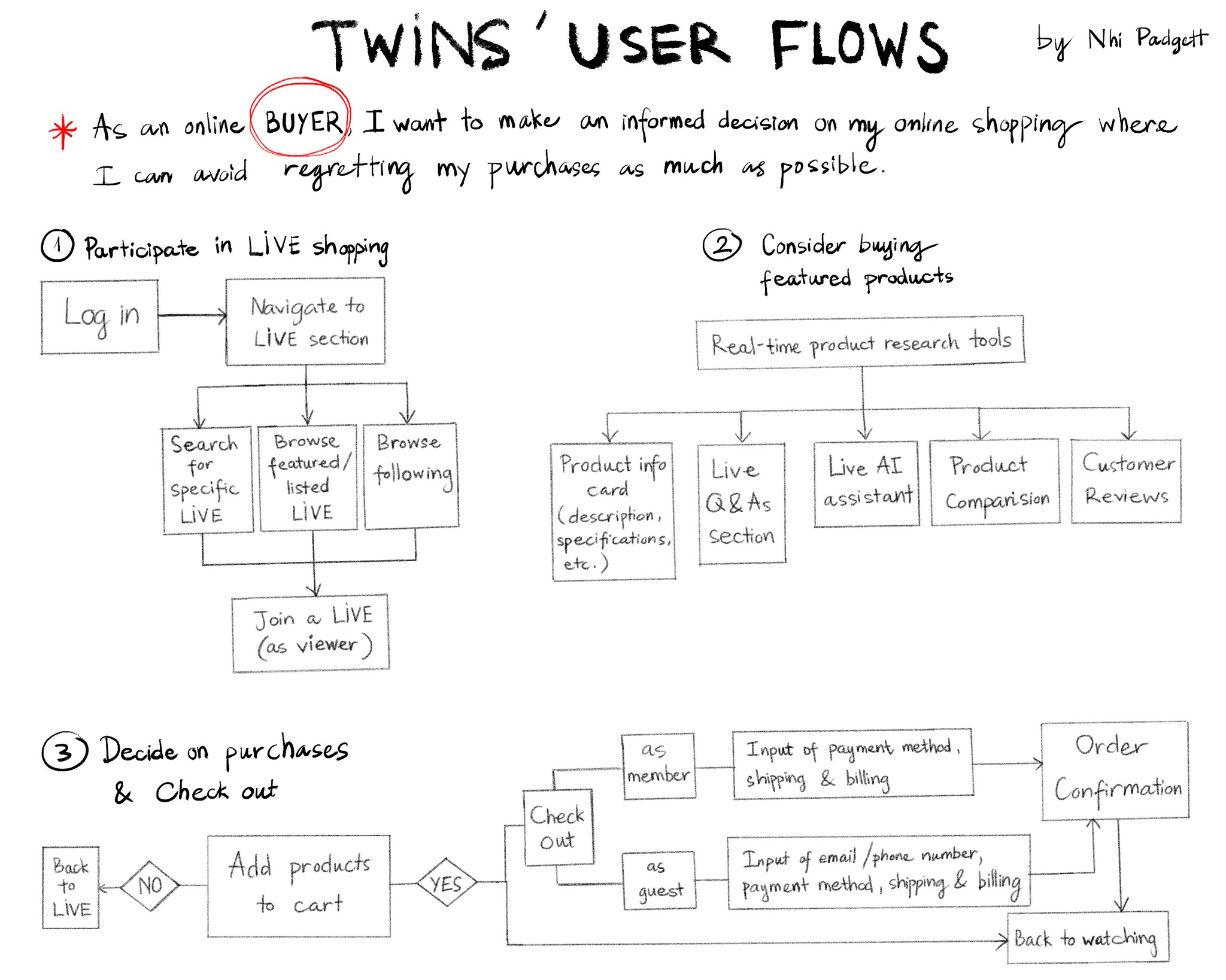
As can be seen, live-shopping features were incorporated early in both flows as they would be the major solution proposed to tackle the current user problems.
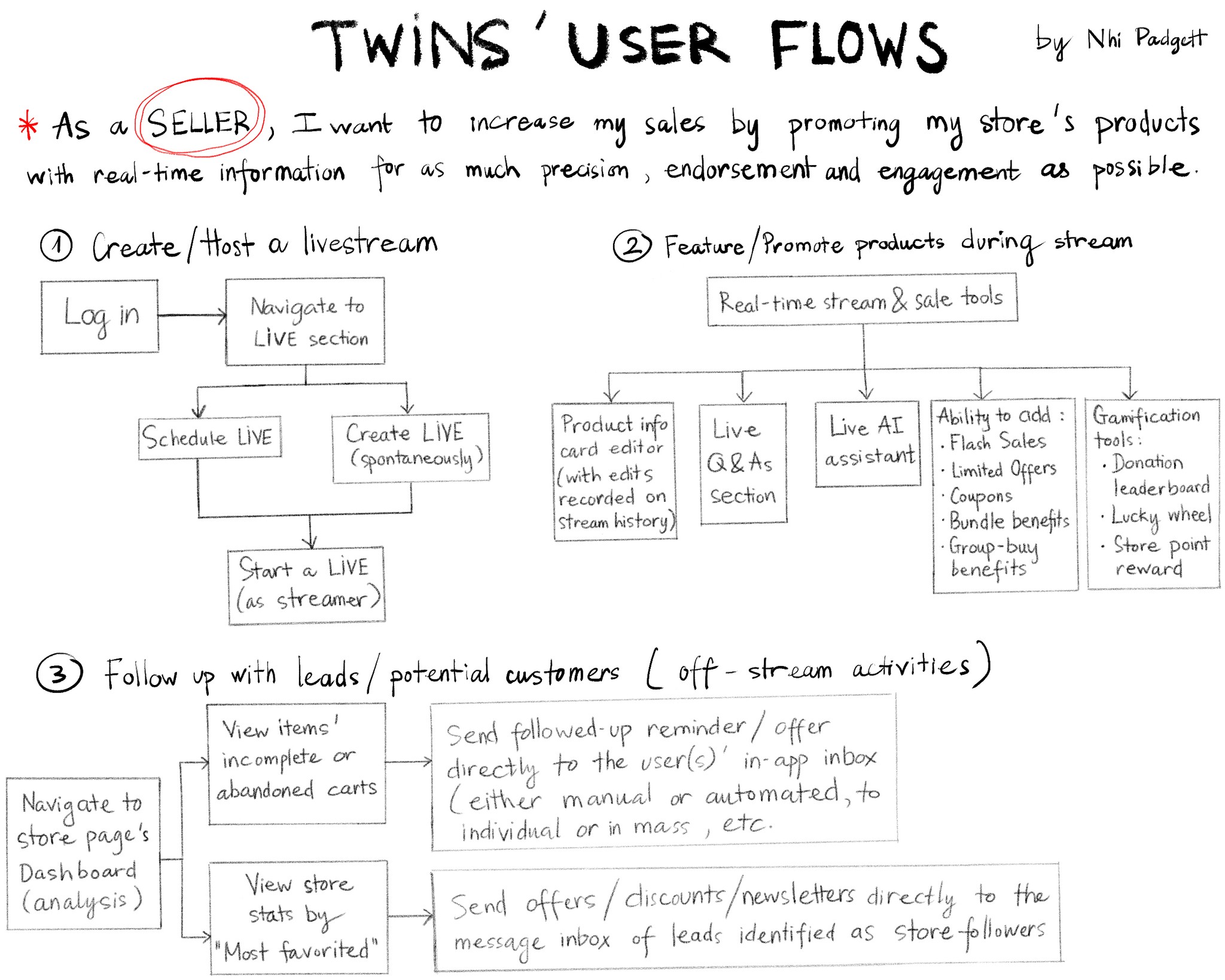
I also acknowledged that the risk of introducing a (seemingly) new feature to an app, is that it could always create new problems, which is why usability testing and design iteration have become my best friends on this UX journey.
DEVELOP
SKETCHES
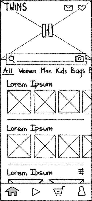
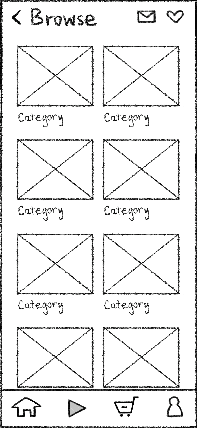
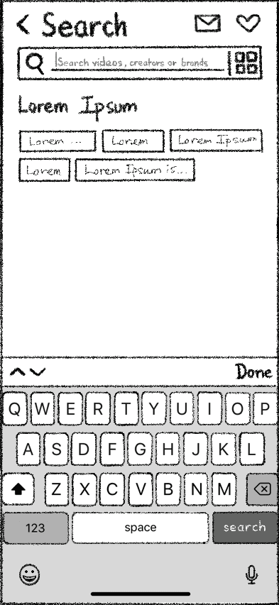
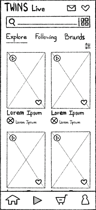
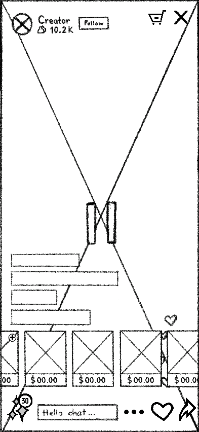
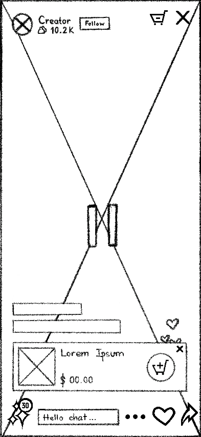
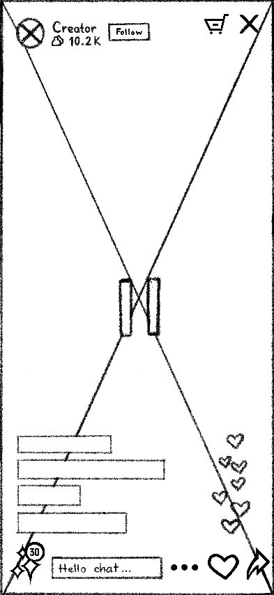
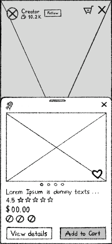
Sketching allowed me to rapidly explore new potential design solutions for the app UI. I focused on the Onboarding process, TWINS Live functionalities, and product comparison tool.
The interactive elements such as the common shopping tools, live-shopping related features, and AI assistant features all emphasized the interconnected experience.
WIREFRAMES
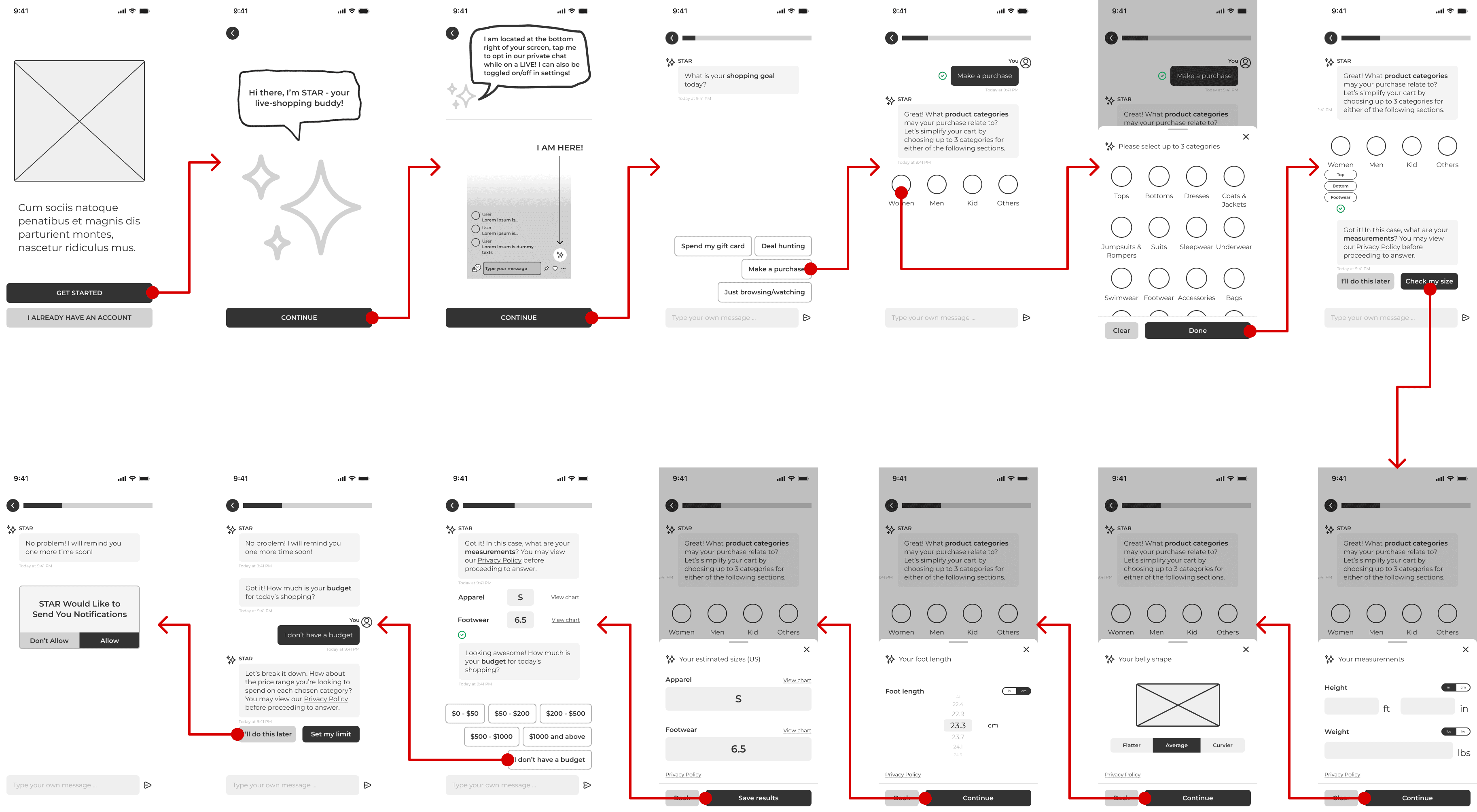
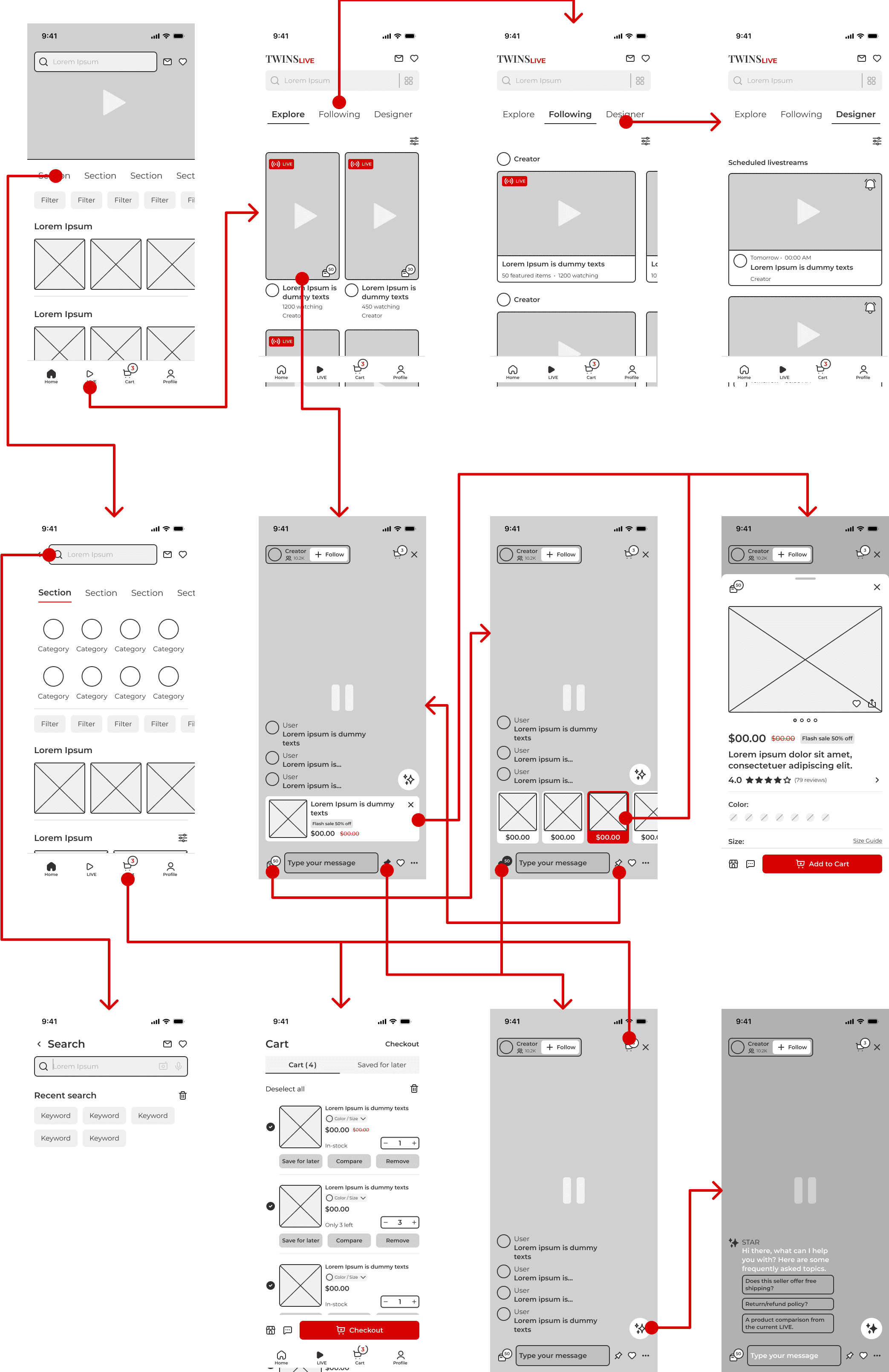
I created mid-fidelity wireframes and arranged them into wireflows to better communicate the MVP paths and information architecture.
These concepts were quickly followed by a usability testing phase with online shoppers in order for me to learn about the design flaws as early as possible.
Onboarding and Personalization panel
TWINS Live: Join a livestream, browse livestream-featured products, and add a featured item to cart
RAPID PROTOTYPING & USABILITY TESTING — ROUND 1
With concepts being laid out, a rapidly developed interactive prototype was put up for 3 moderated usability tests, and the results were measured using two types of Key Performance Indicators (KPIs): Time on task and Conversion rate. The data reveals a number of glaring issues within early live-shopping features.
My goal when conducting these usability studies was:
To determine if users can complete core tasks within the MVP prototypes.
To determine if TWINS Live is difficult to use.
Key touchpoints
Overall, users managed to join an ongoing livestream seamlessly, within about 1 min on average.
The tasks of browsing livestream-featured products and comparing them with icons and AI logics were confusing for users to complete, resulting in an unexpectedly long amount of time (and even fails).
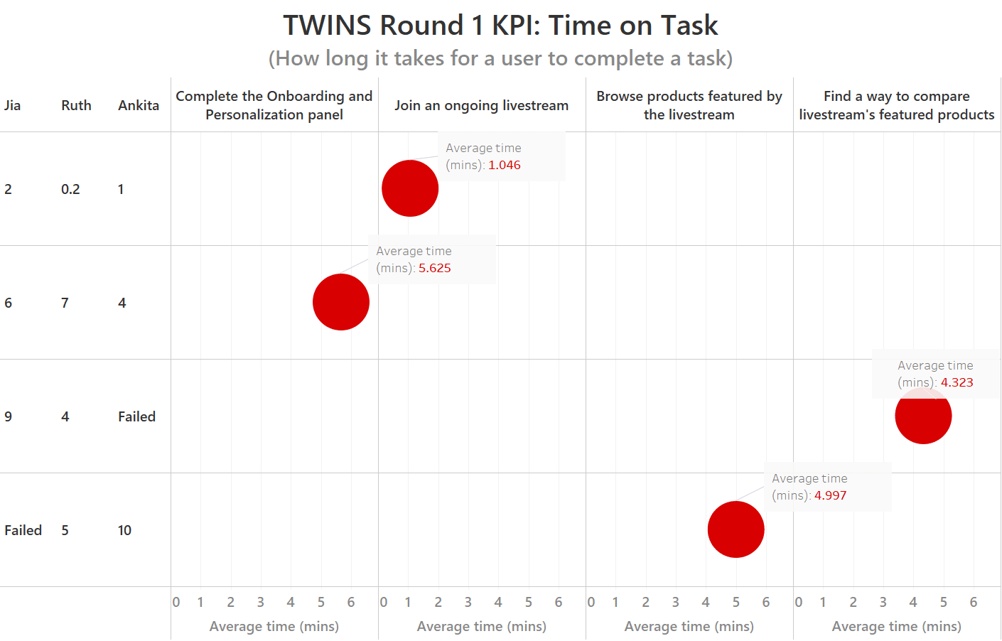
Key touchpoints
On average, 100% of users completed the first MVP route (Onboarding and Joining a livestream) with ease.
The rest of the prototype presented completions with difficulty and some failures, which resulted in around 56% of completion rate overall.
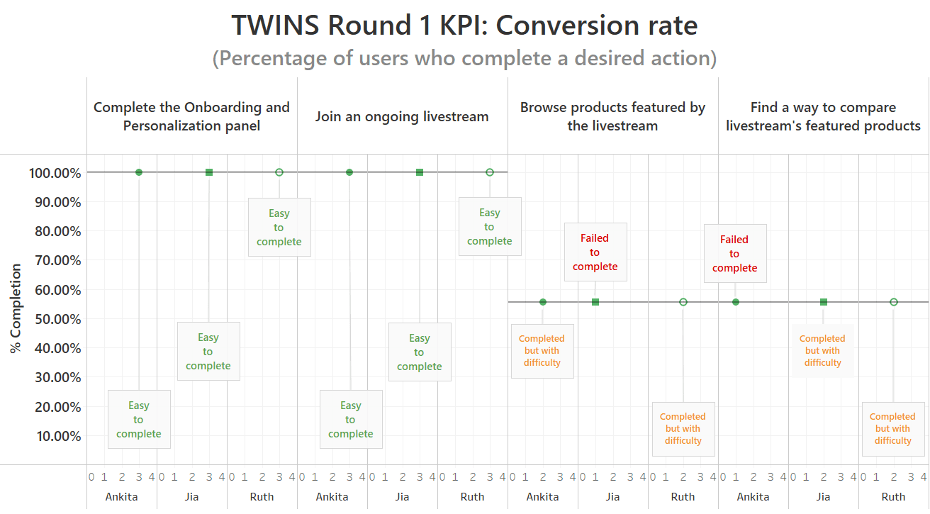
100% completion rate
55.6% completion rate

Key takeaways
Conversational interactions with the AI companion to replace traditional textboxes were preferred by all the interviewed online shoppers.
Livestream/video-shopping was a refreshing experience for the users, but most Live-related UI features and elements would require additional user cognitive loads and muscle memories.
Most users found it confusing and practically pointless to have the livestream-featured products compared only by the AI assistant.
VISUAL IDENTITY & STYLE GUIDE
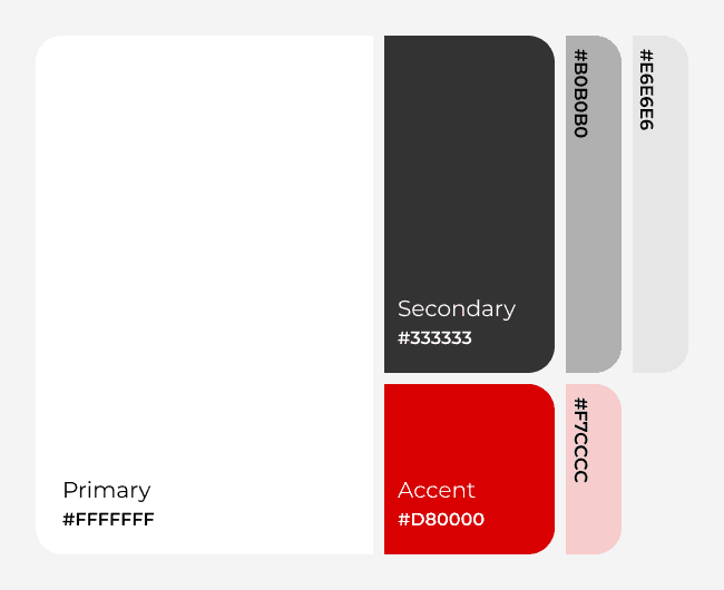
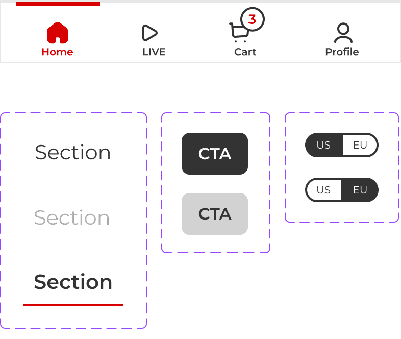
I also gave a refresh on TWINS visual identity and a rework on their design system.
With the introduction and highlight of the new feature TWINS Live, the logo would adapt an additional touch in its design to communicate their brand identity more coherently.


HI-FI PROTOTYPES & USABILITY TESTING — ROUND 2
After gathering user feedback from early usability tests on the Mid-fi prototypes, I started working on the design iteration towards the final concepts and Hi-fis. This time, a new separated MVP route of the product comparison feature was developed to address the interviewed users pain points.
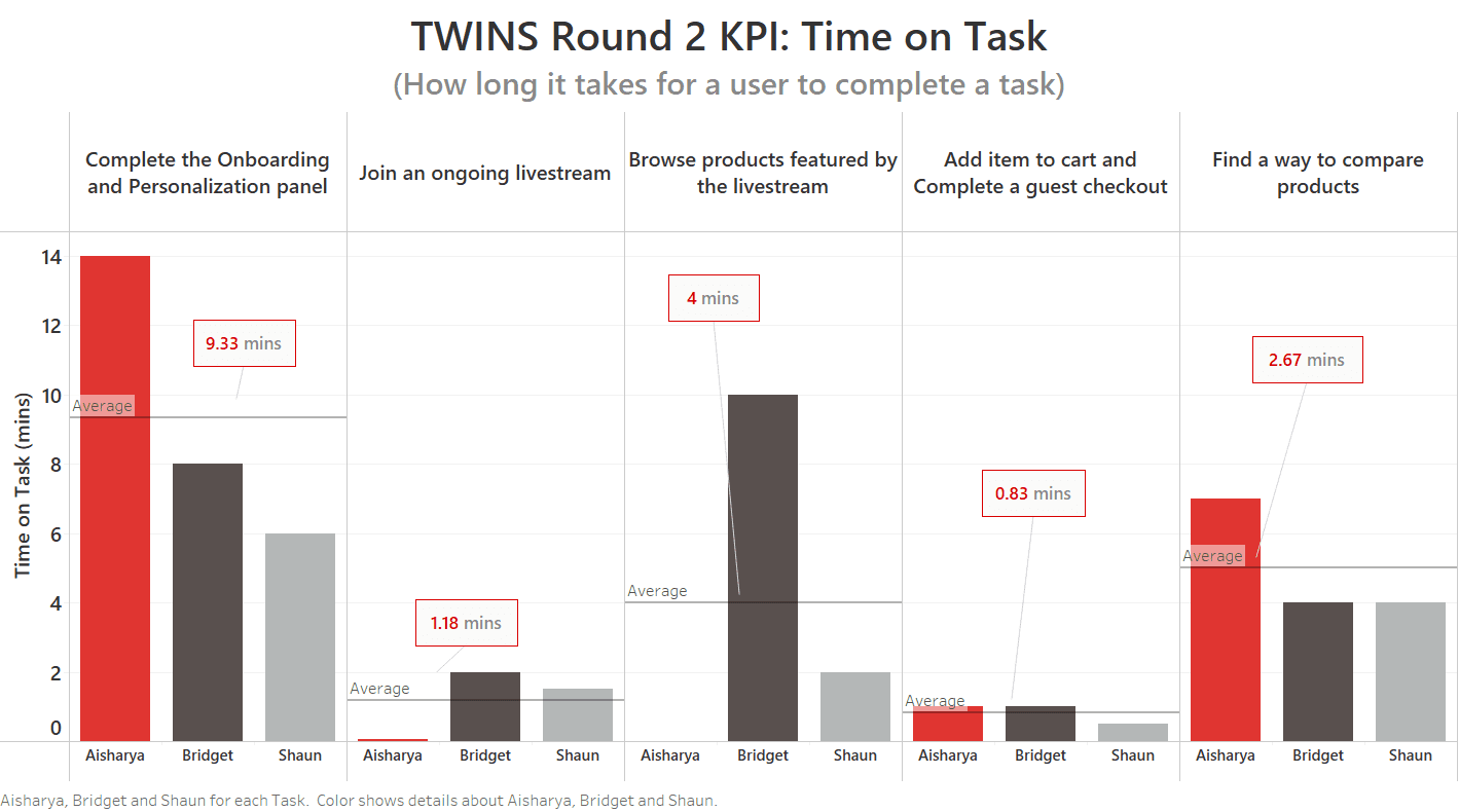
Furthermore, three moderated usability tests with participants self-identifying as online shoppers were conducted for this second round, with KPIs measurements based on Time on task, Conversion rate, and Use on Navigation vs Search.
Key touchpoints
Overchoice during onboarding questionaries became a new issue. Not being able to select multiple options was also a co-existing issue in that matter.
Live-shopping related flows and elements (mostly icons) still caused serious confusion for users. Part of this was also the lack of context.
Tougher to pay attention to the AI companion without reminder that it was there, especially when there were all sorts of motions going on on a livestream.
Onboarding short (Personalization questionaires)
Purchase a livestream-featured item short
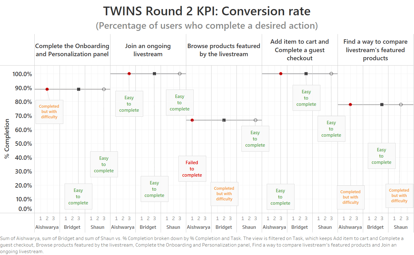
100%
completion rate
66.7%
completion rate
88.9%
completion rate
100%
completion rate
77.8%
completion rate
Key touchpoints
Overall, completion rate has improved significantly: despite taking longer than the given time for each task, users were much more likely to complete most tasks.
The forth MVP route of product comparison tool with conversion rate increasing by over 20% has shown that users for now still prefer their traditional methods. Furthermore, one participant suggested that the AI could "ask" the seller to compare such products right on the livestream.
TWINS Round 2 KPI: Search vs. Navigation
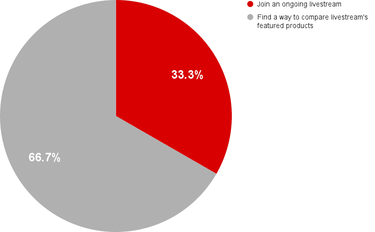
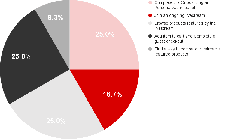
Usage on Search
Usage on Navigation
Key touchpoints
For most tasks, users took time to navigate and explore the app. Navigation in specific product comparison flow was least used, while the Search feature account for about 67% of usage in this MVP route.
Both Search tool and Navigation scheme were fairly seen in how users managed to join a livestream.
Compare products short
FINAL THOUGHTS
"When you try to make your decision, don't make yourself crazy trying to find the perfection decision. Just make a decision, and then make it right." - Guy Kawasaki, 2024 on an interview with ADPList co-founder Felix.
Through this project, I rediscovered my mission in helping users make a "better" shopping decision. From a business standpoint, this decision could be something that generates more leads, or an increase in conversion rate, or a cart completion. On the other hand, from a user perspective myself, I do want to have the confidence in my decision making, and to be reassured that whether I will achieve certain goals or not, just feeling good about making my decision is already the first win. This mindset has helped me in finding empathy when designing for the users and the business. Design transparency focuses on brand loyalty. Once the trust is built, the company organically gains a brand advocate and everything that follows them.
