
CHANGEMATE
RESPONSIVE WEB / MOBILE-FIRST DESIGN
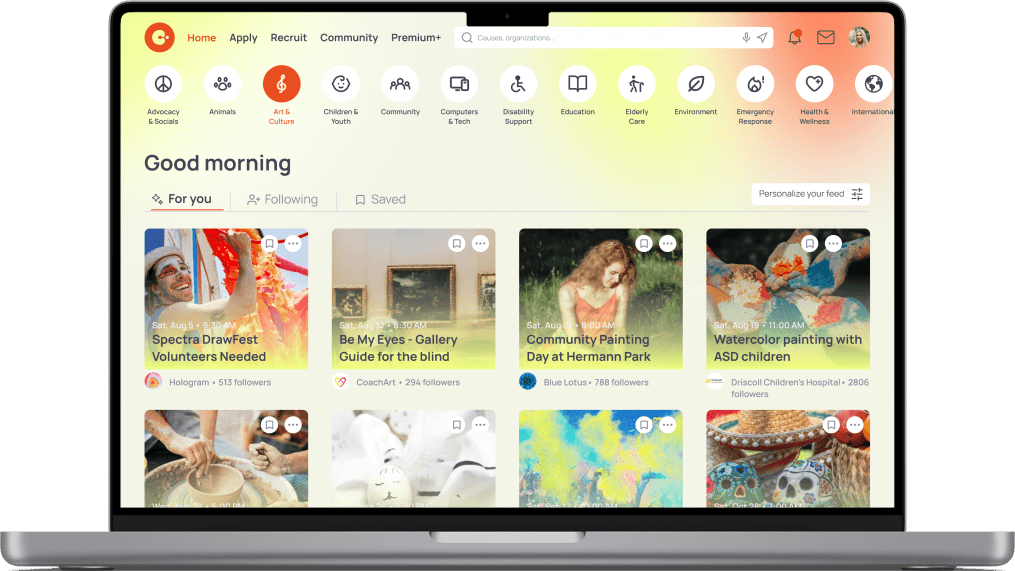
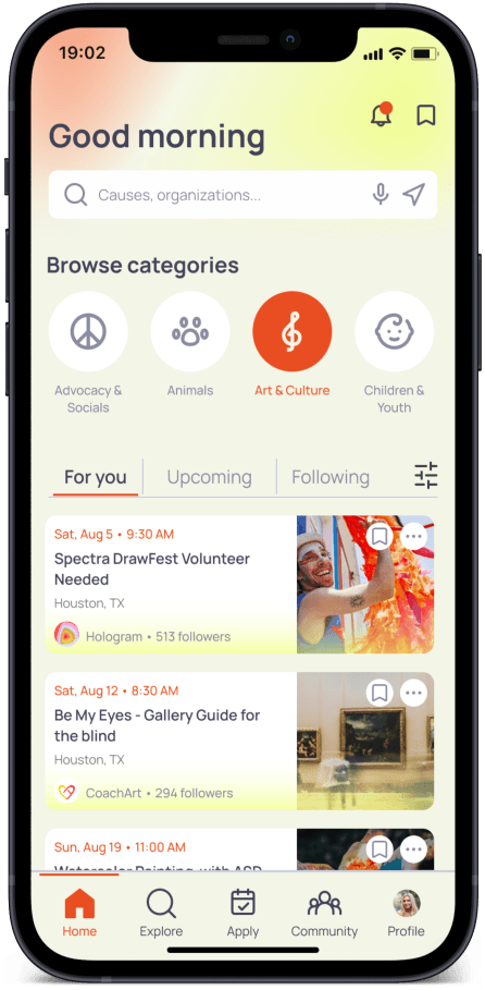
In recent years, the national volunteer rate saw inevitable declines as individuals started changing how they socialized in the wake of the pandemic. It has become a challenge for organizations to find helping hands as well as for people to find jobs and meaningful purposes.
As a contribution to my local community, this project showcases my exploration on how our volunteer network could continue to socialize and foster encouraging environments. Focusing on a dedicated app design, with a mobile-first approach, I've created an scalable user-centric system that seamlessly transitions across molbile and desktop devices.
My role
End-to-end product designer throughout the entire UX process
UX research, Prototyping, UI design, Visual Identity design
Developed and maintained a consistent design system
Timeline
Feb 2023 - June 2023
DEFINE THE PROBLEM
Qualitative Research
In order to gain a deeper understanding of user's behaviors, needs, motivations or frustrations when trying to connect with their volunteer community, I wanted to recruit qualified participants for my user interviews.
Starting the user research process, I sent out screener survey to volunteer groups on social media. From a pool of 12 responses, I chose 5 participants that were at least "somewhat actively" seeking to socialize and make an impact.
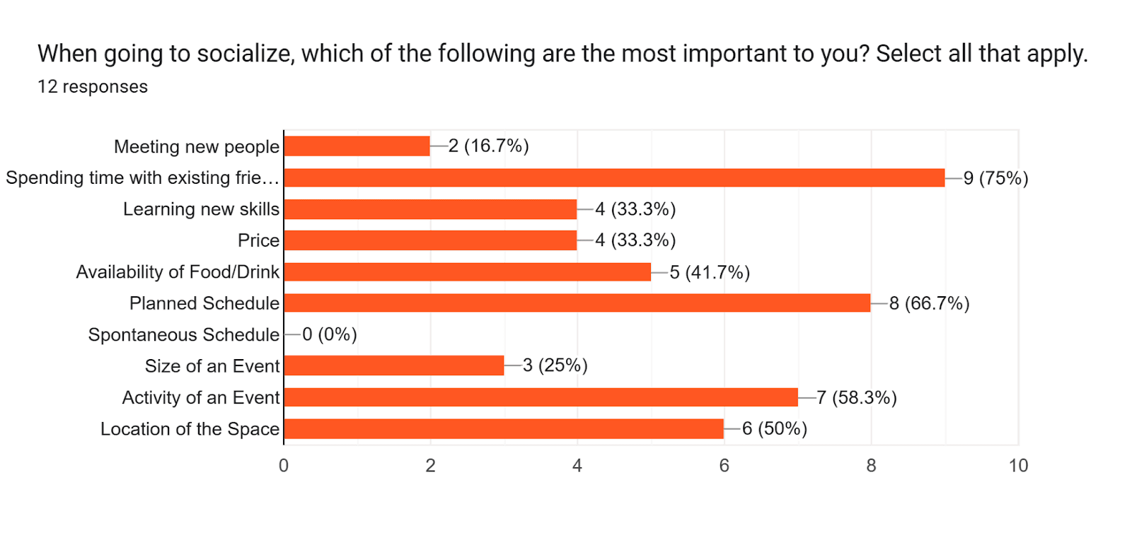
(Data surveyed more than 5 users who have participated in social activities)
From the survey result, I also discovered that most of the participants were facing these four challenges in common:

This research methodology helped me in refining the hypothetical problem statement for my project, from which I could come up with more precise HMW solutions.
User Interviews
Next, I conducted a series of 5 moderated interviews with recruited participants to better understand the user goals and pain points.
Each interview was done remotely through video call or in-person, and lasted about 30 minutes. Here are some of interview quotes that I found strongly support my problem statement:
Competitor Analysis
Being one of the major tasks during my research phase, Competitor Analysis gets me up to speed in my project space by perceiving how existing rival products on the market perform.
I chose to evaluate Engage, Nextdoor, and Eventbrite, which are both nonprofit & social event-organizing apps, based on the three following Heuristic Principles:
Consistency & Standards
User Control and Freedom
Recognition rather than Recall
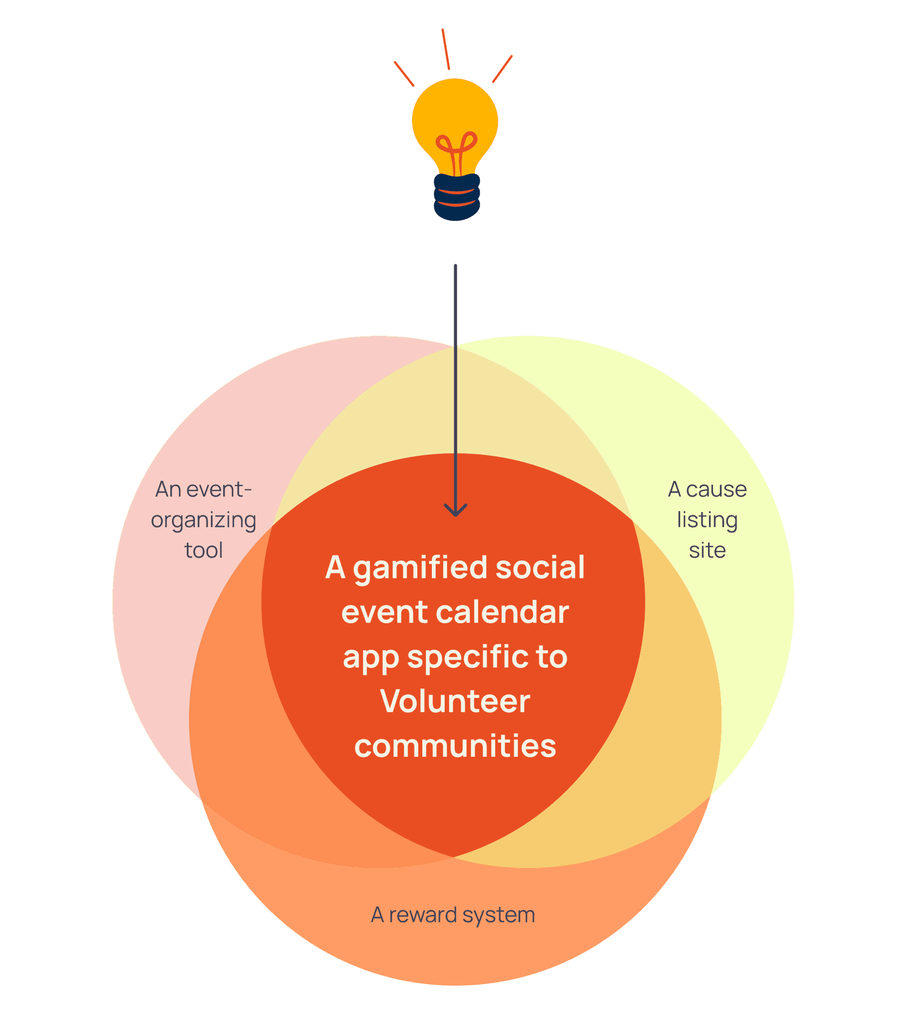
From these platforms, I realized why current solutions are not working, and how I can improve traditional nonprofit-curated tools by adopting existing modern social products.
SYNTHESIZE AND ANALYZE THE DATA
Affinity Map
The research phase generates a lot of information and insights. Affinitizing especially means identifying emerging themes from the research to establish a guided vision for the design.
By categorizing and grouping all the findings based on themes and patterns, my goal during this process was to uncover relationships within all of the data.
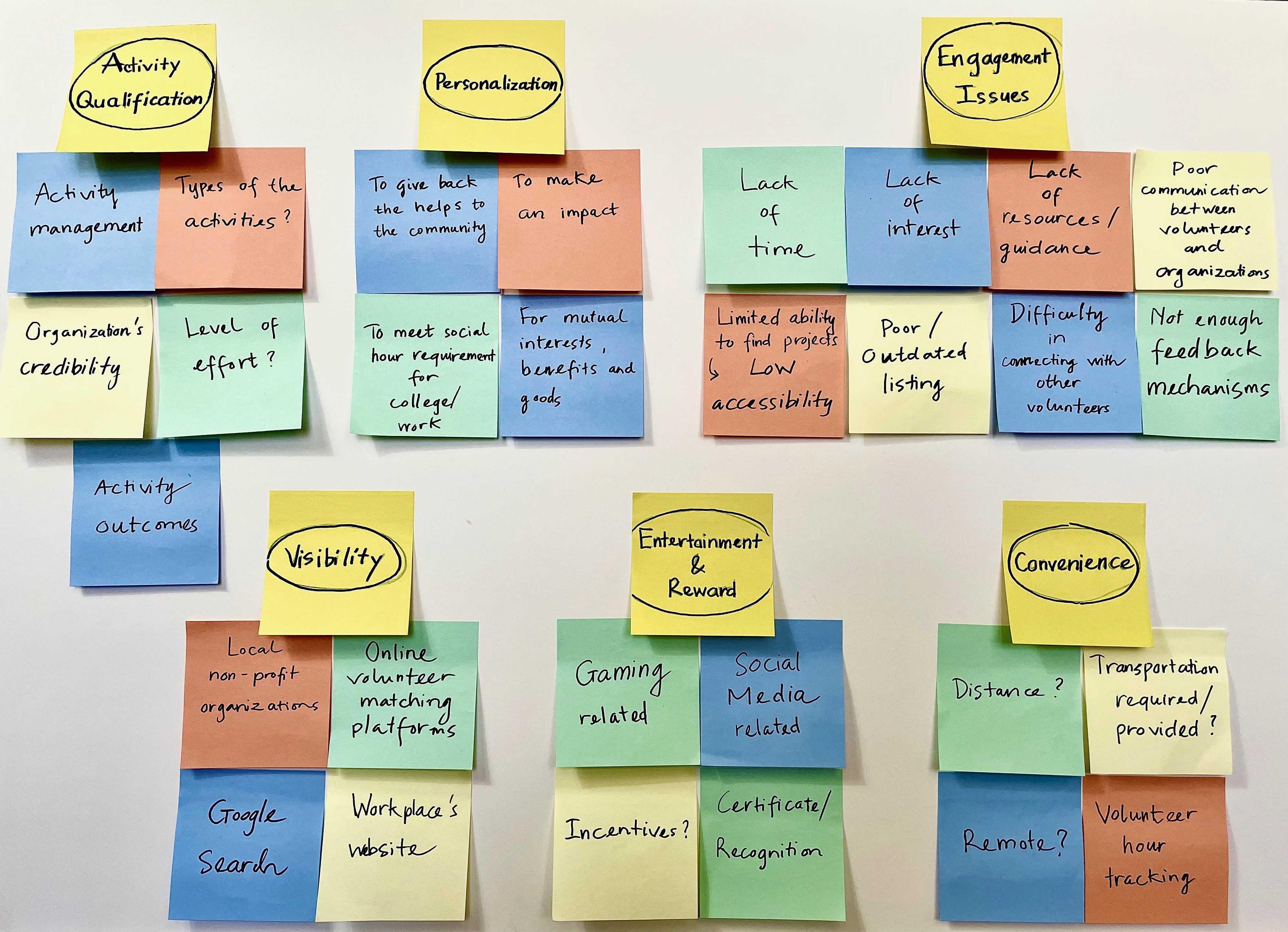
A recap of the major themes
Transparency
How is the event managed?
Types of the event?
Organization's credibility?
Level of effort?
Activity outcome?
Feedback mechanism?
Engagement issues
Lack of time
Lack of interest
Lack of resources/guidance
Poor communication
Convenience
Distance?
Remote?
Transportation required/provided?
Personalization
Hour tracking?
Location-specific?
Activities aligned with personal interests and values?
Visibility
High accessibility?
Up-to-date listing?
Locals/workplaces?
Google SEO and keyword optimizations?
Entertainment & Reward
Gamification?
Incentivization?
Certification/Recognition?
Social media relation?
What might be the Solution?
How might we build an event-organizing tool that allows nonprofits and volunteer network to safely connect, socialize and stay on-track of their missions?
User Personas
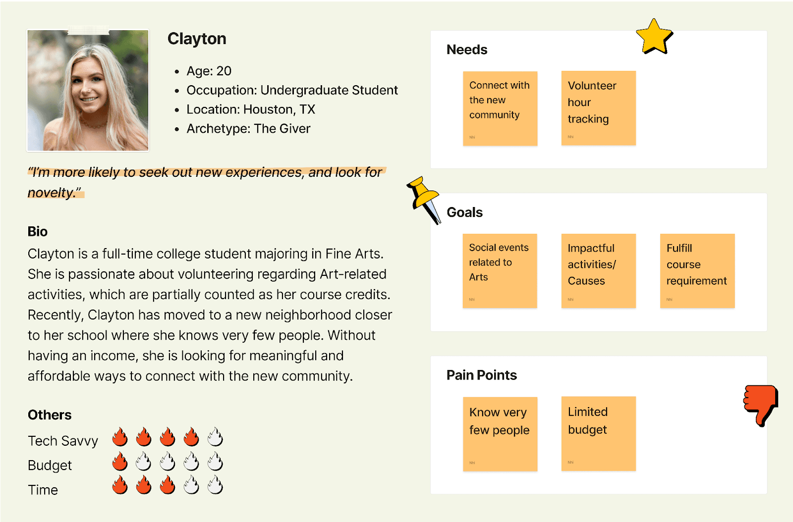
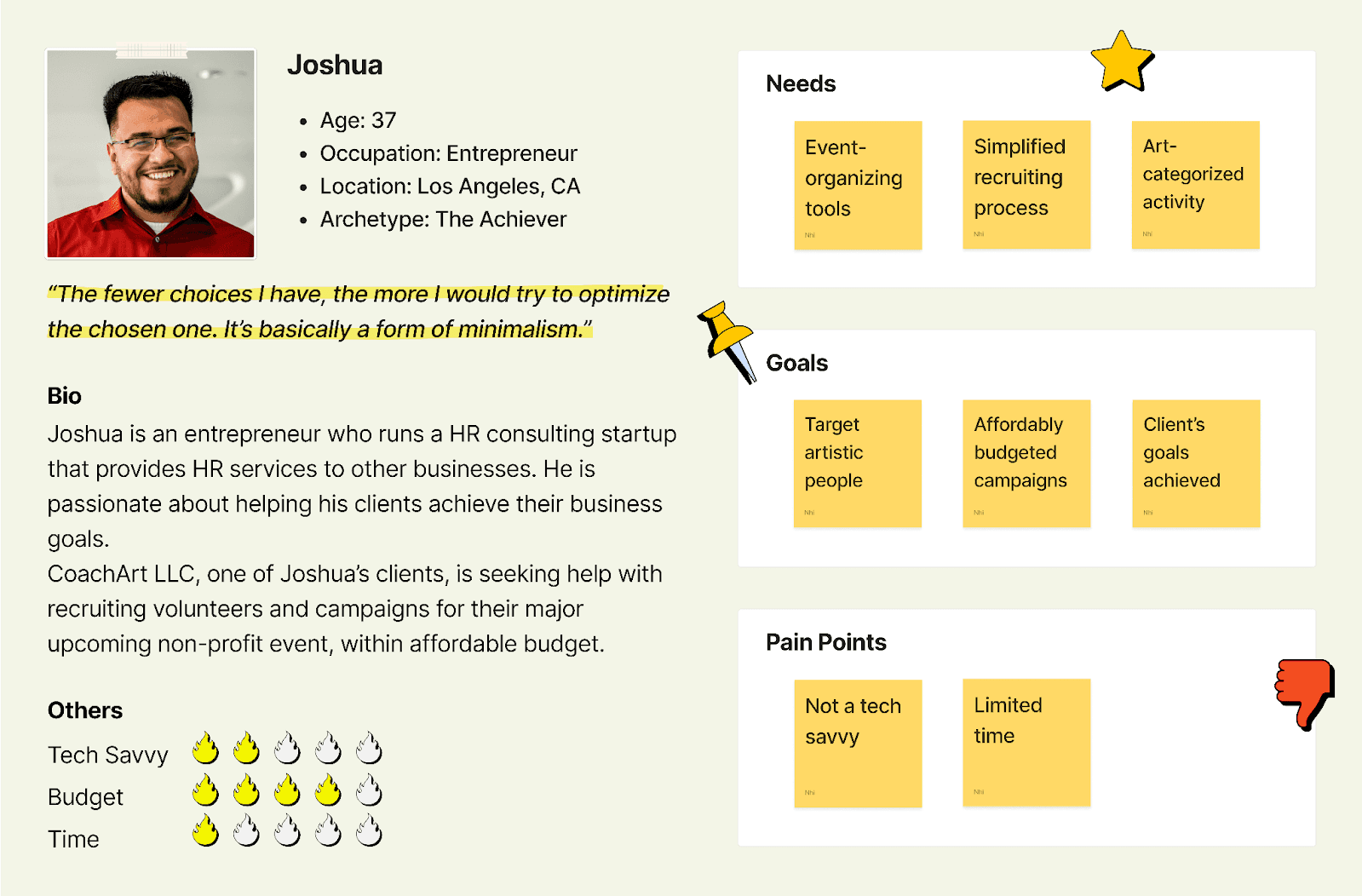
The user research findings also allowed me to create two personas representative of potential candidates.
The purpose of this is to put myself in the user’s shoes and keep their needs, goals and pain points at the forefront of my design.
ORGANIZE IDEAS INTO DIRECTION
User-story Maps
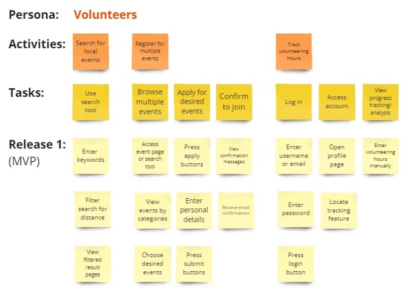
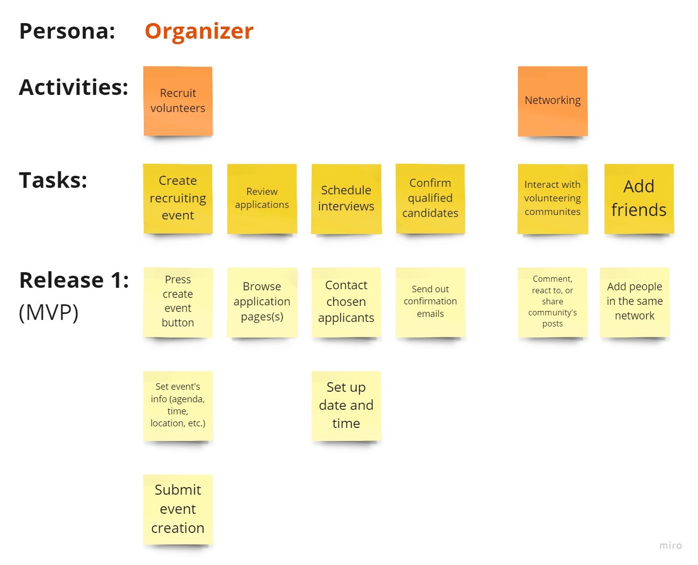
User story is a narrative description of a user's experience as they interact with a product or service to achieve a specific goal or complete a task. Organizing user stories horizontally based on user tasks and vertically by priority provides me a holistic understanding of the most critical paths the user might take, also known as the Minimum Viable Product (MVP).
For my personas, two perspectives were taken into account: the Volunteer vs the Organizer.
User A: As a volunteer, I want to find a local volunteering activity, so that I can fulfill my social course credits while making new connections in a meaningful way.
User B: As an HR agency, I want to create an opportunity, so that I can help my client recruit volunteers for their organization.
User Flows
A user flow is a visual representation of the steps a user takes to accomplish a specific task or goal within our digital product. Understanding user perspectives from the user stories , I mapped out two user flows to demonstrate the critical routes users might follow when interacting with the app.
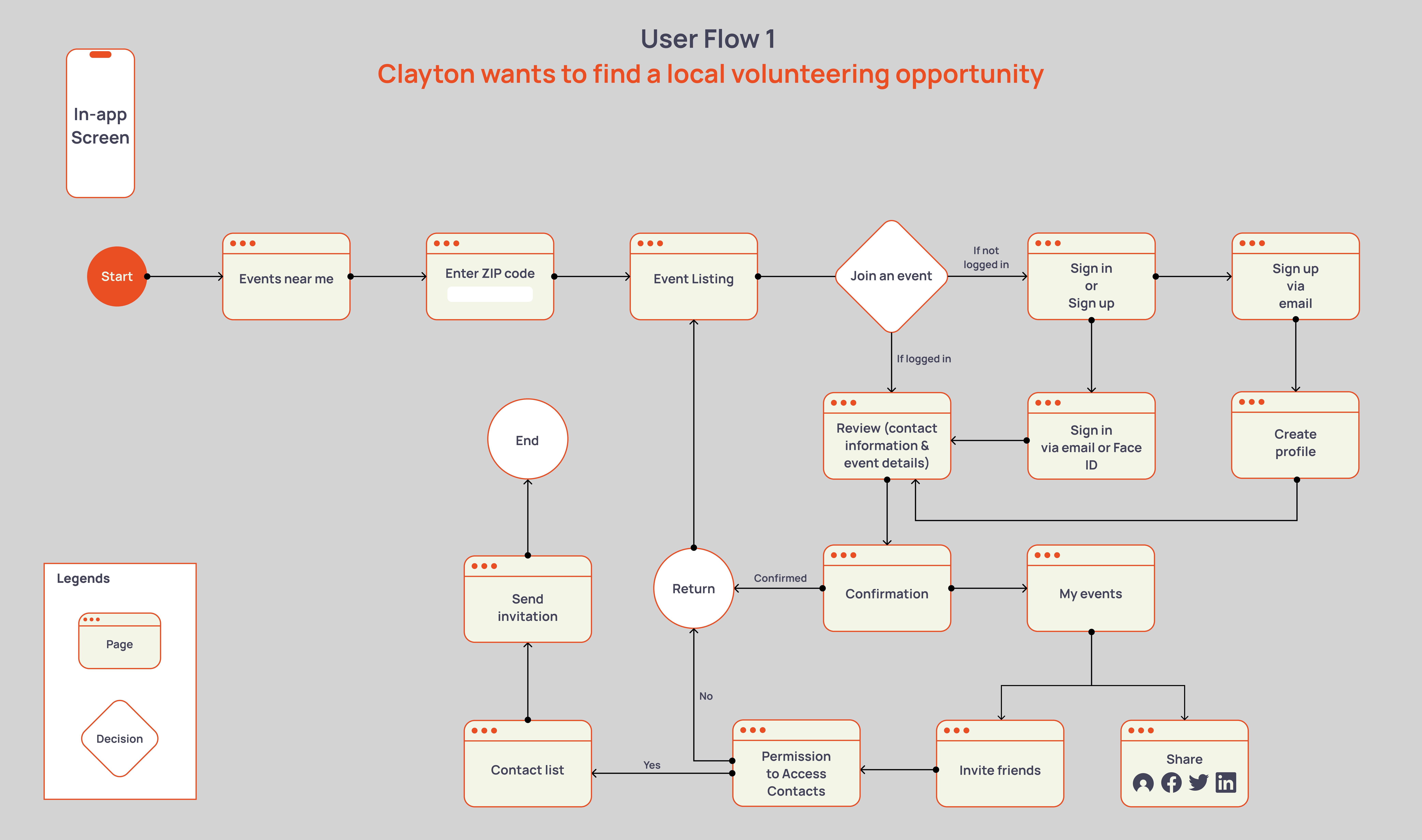
Some key features included the ability to invite existing friends, which makes people more likely to attend events, and the ability to share the listing to social media.
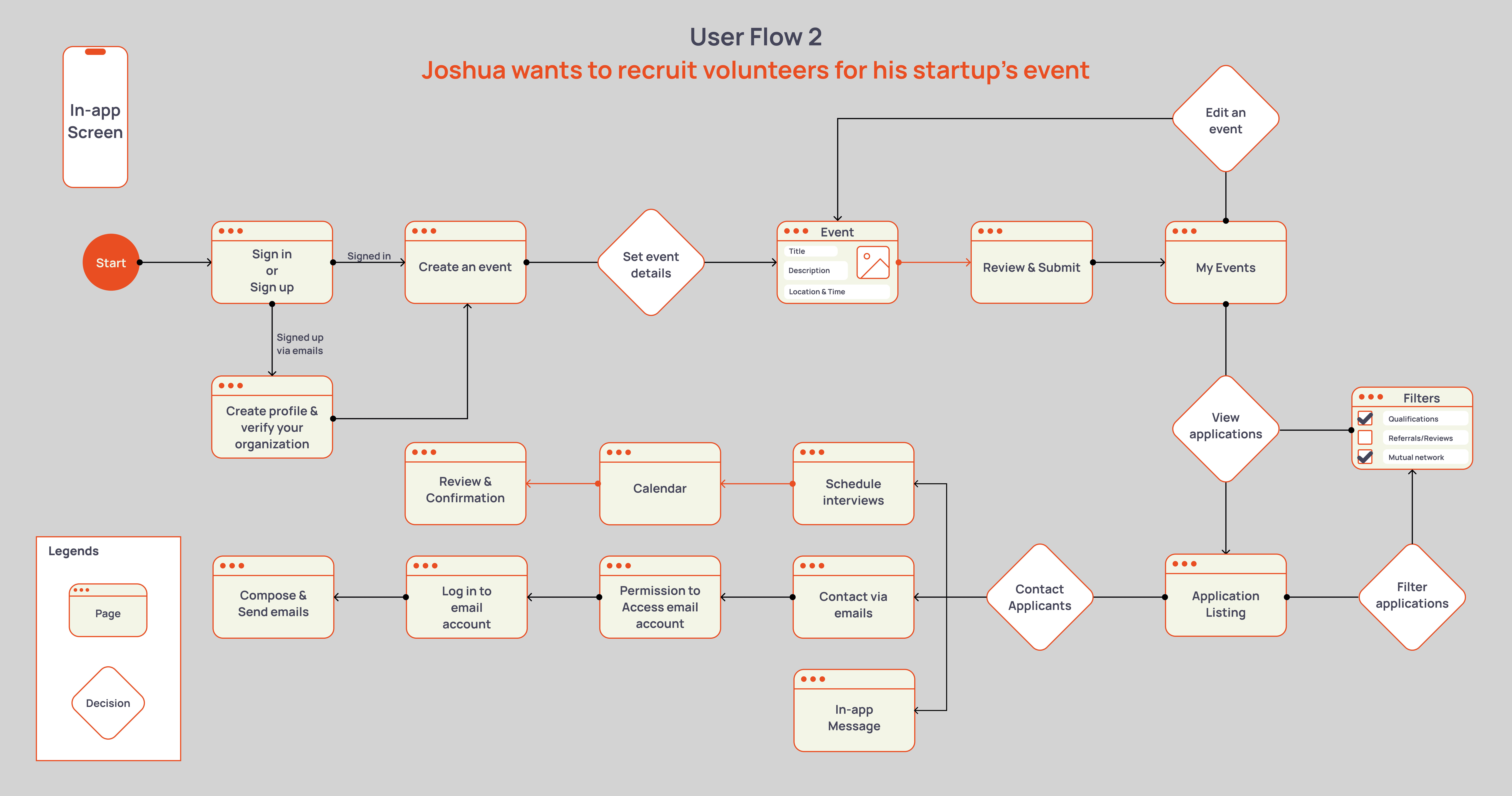
I was also extremely concerned with a user’s sense of time and safety, so I added the ability to filter applications via referrals or mutual connections.
TURNING CONCEPTS INTO DESIGNS
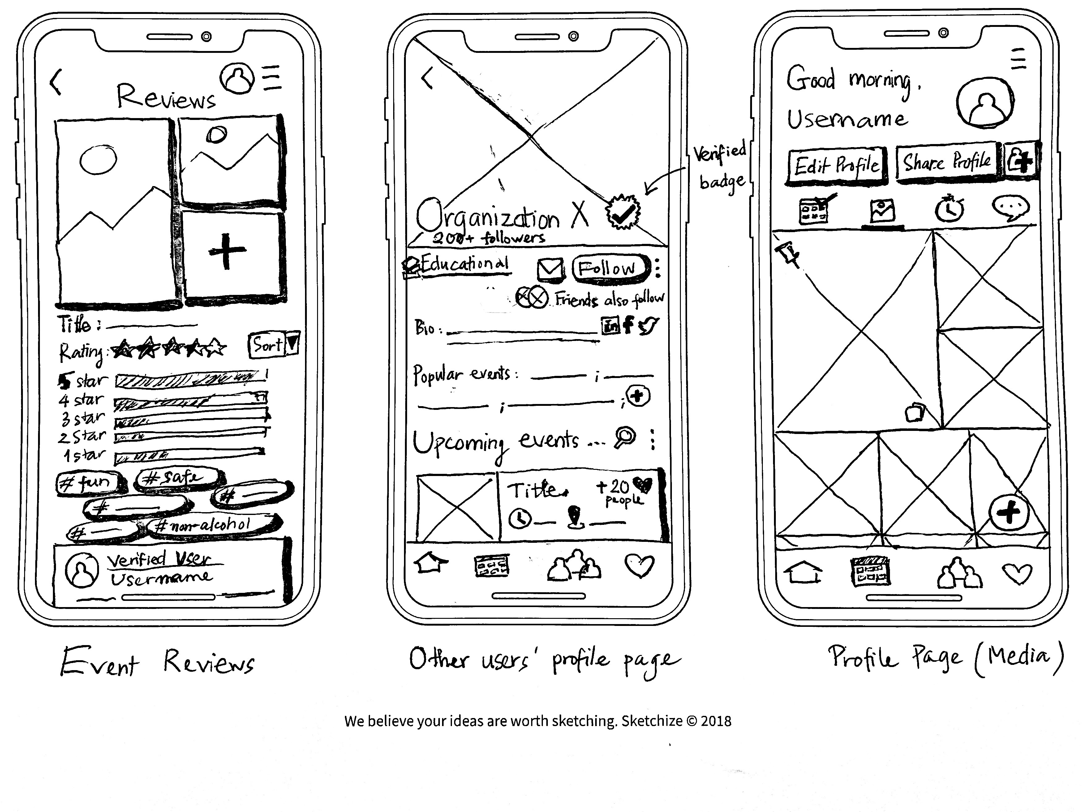
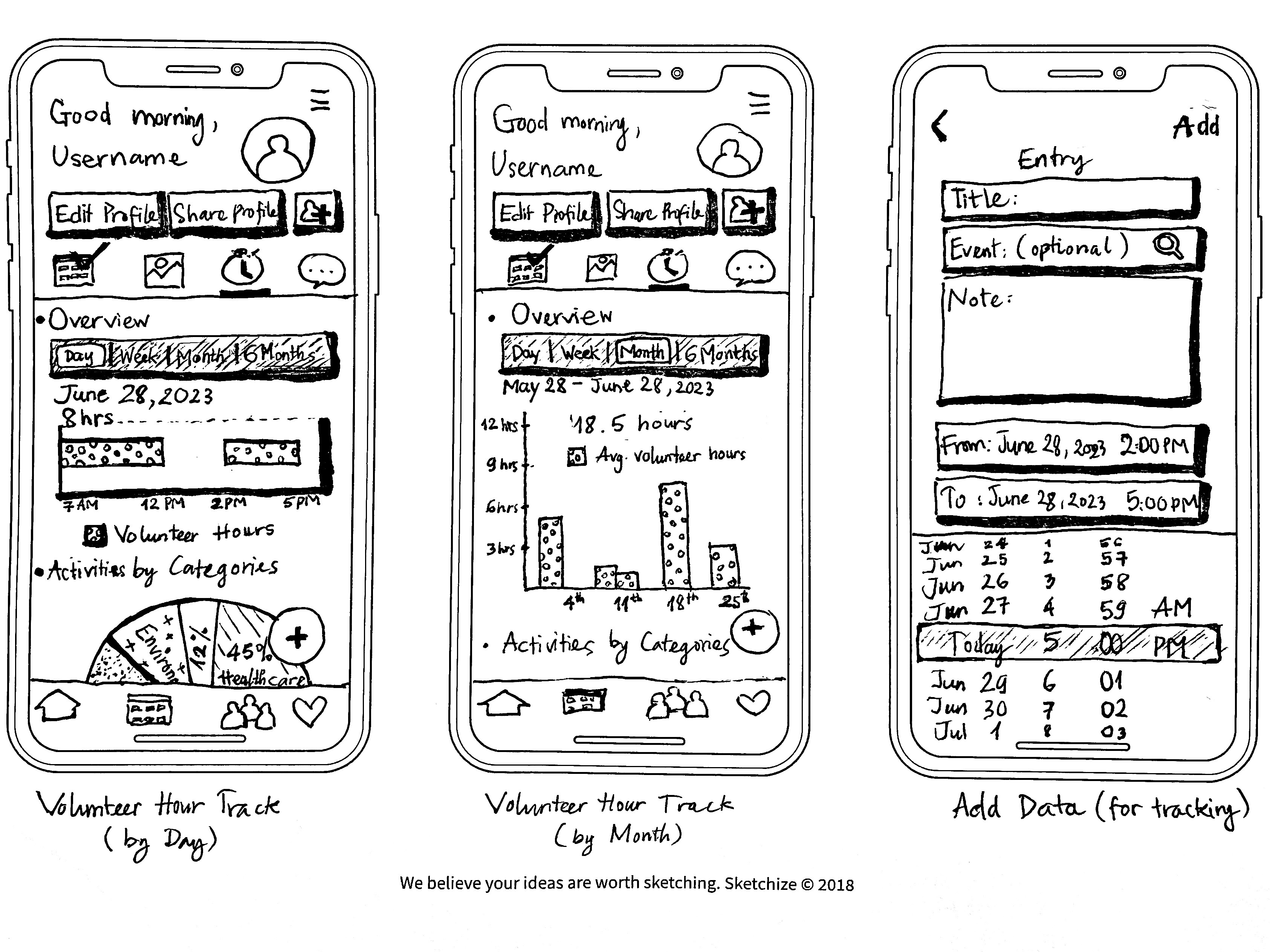
Sketches
With the information architecture laid out, I now had the key touchpoints for designing a volunteer connection app.
Given the project time constraint, CHANGEMATE would first and foremost focus on three critical routes:
Onboarding & Account Setup
Apply for an Opportunity
Create an Event
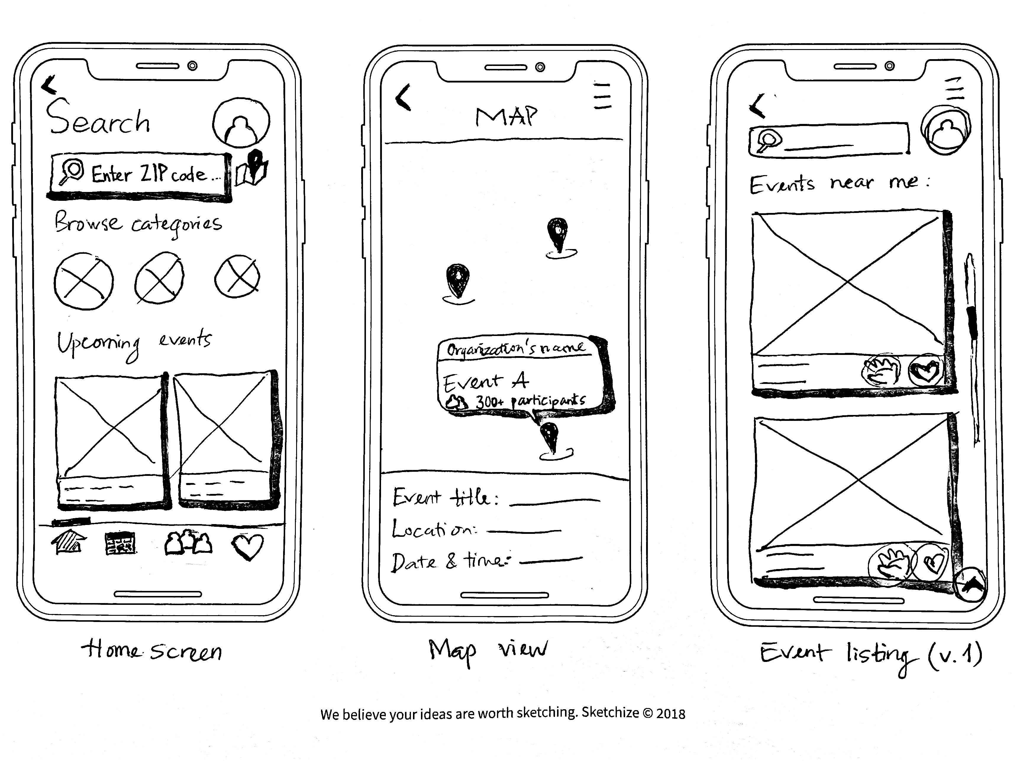
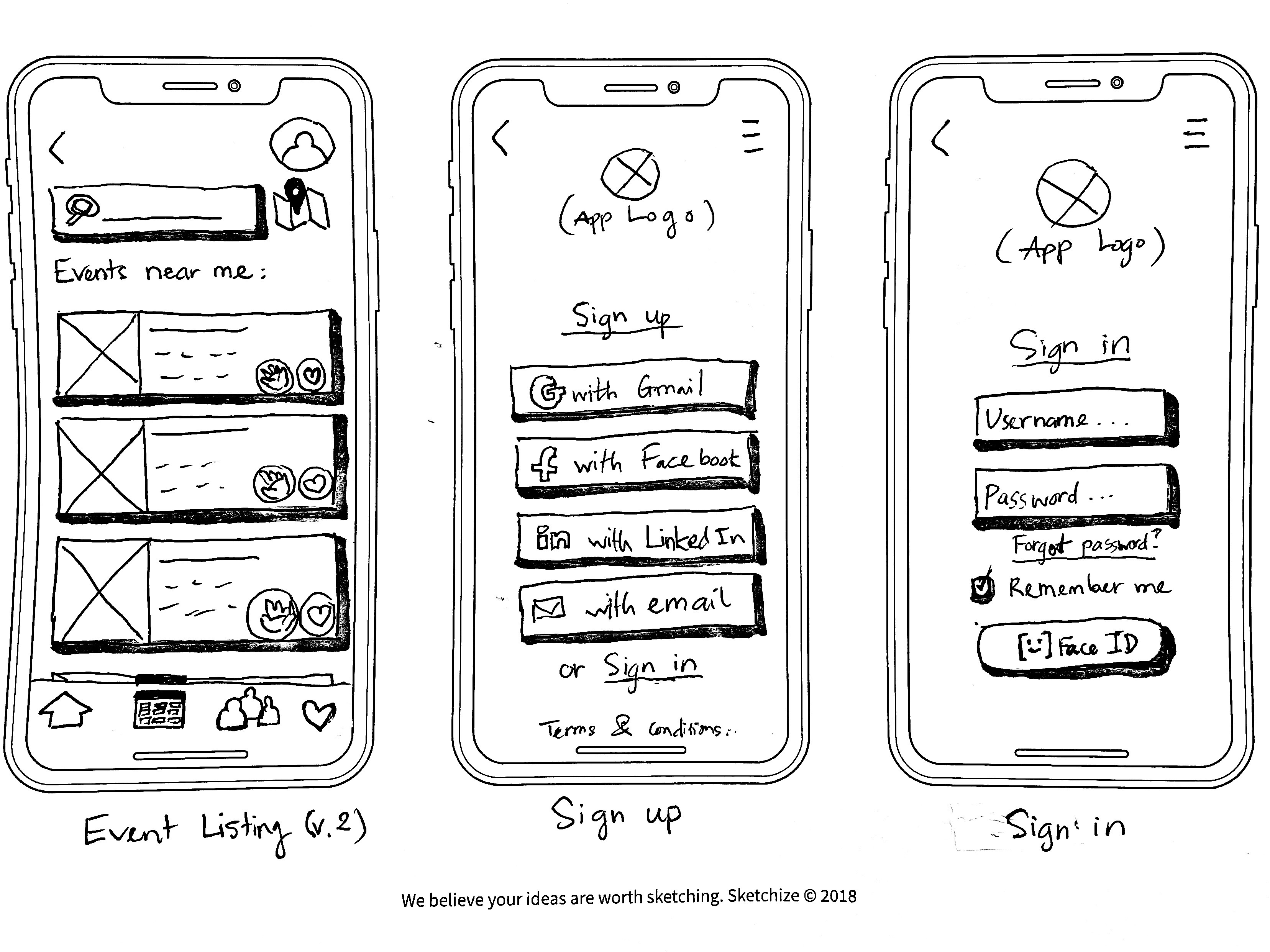
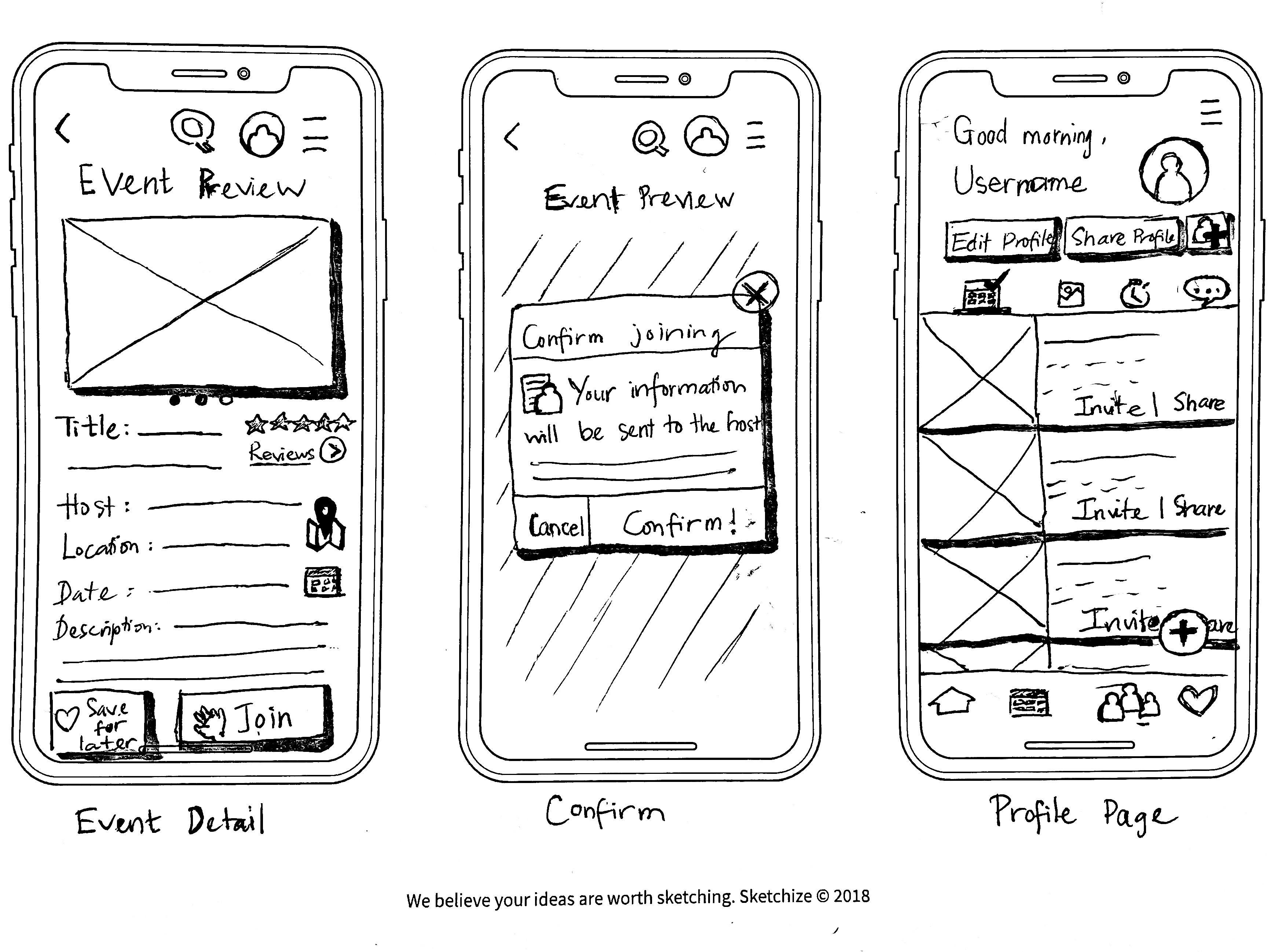
Napkin sketches came into play as they would help me quickly ideate and iterate on the user interfaces for these flows.
Guerilla Tests & Iterations
For this part, I utilized POP by Marvel to digitize my low-fidelity sketches into a clickable prototype. Using the digital platform, I conducted five guerilla usability tests.
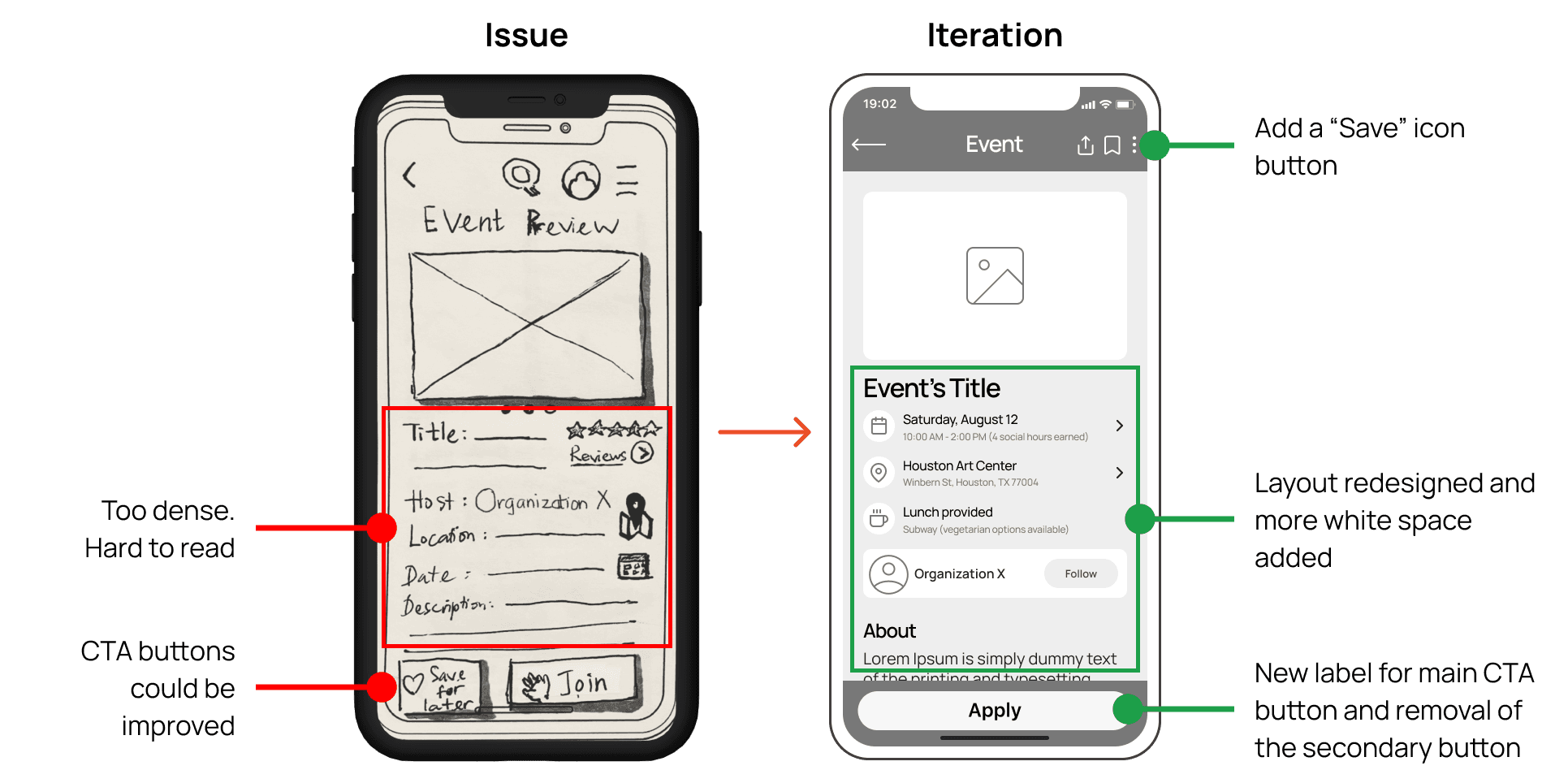
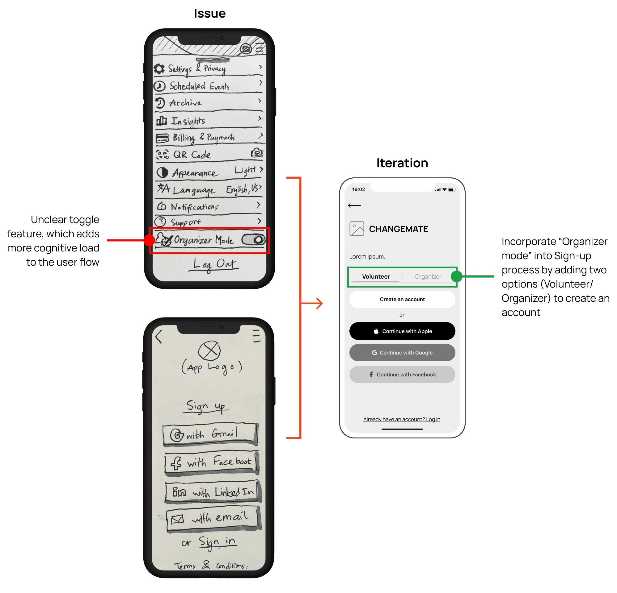
Early usability testing allowed me to identify glaring issues with my existing methodologies and findings above. By iterating on my sketches, I was able to start working on some low-fidelity wireframes.
Event layout and functionality iteration
Account registration iteration
Wireframes
Wireframes are skeletal representations that outline the structure of a webpage or app. They provide a guide to essential elements, layout, and functionality without detailing visual design.
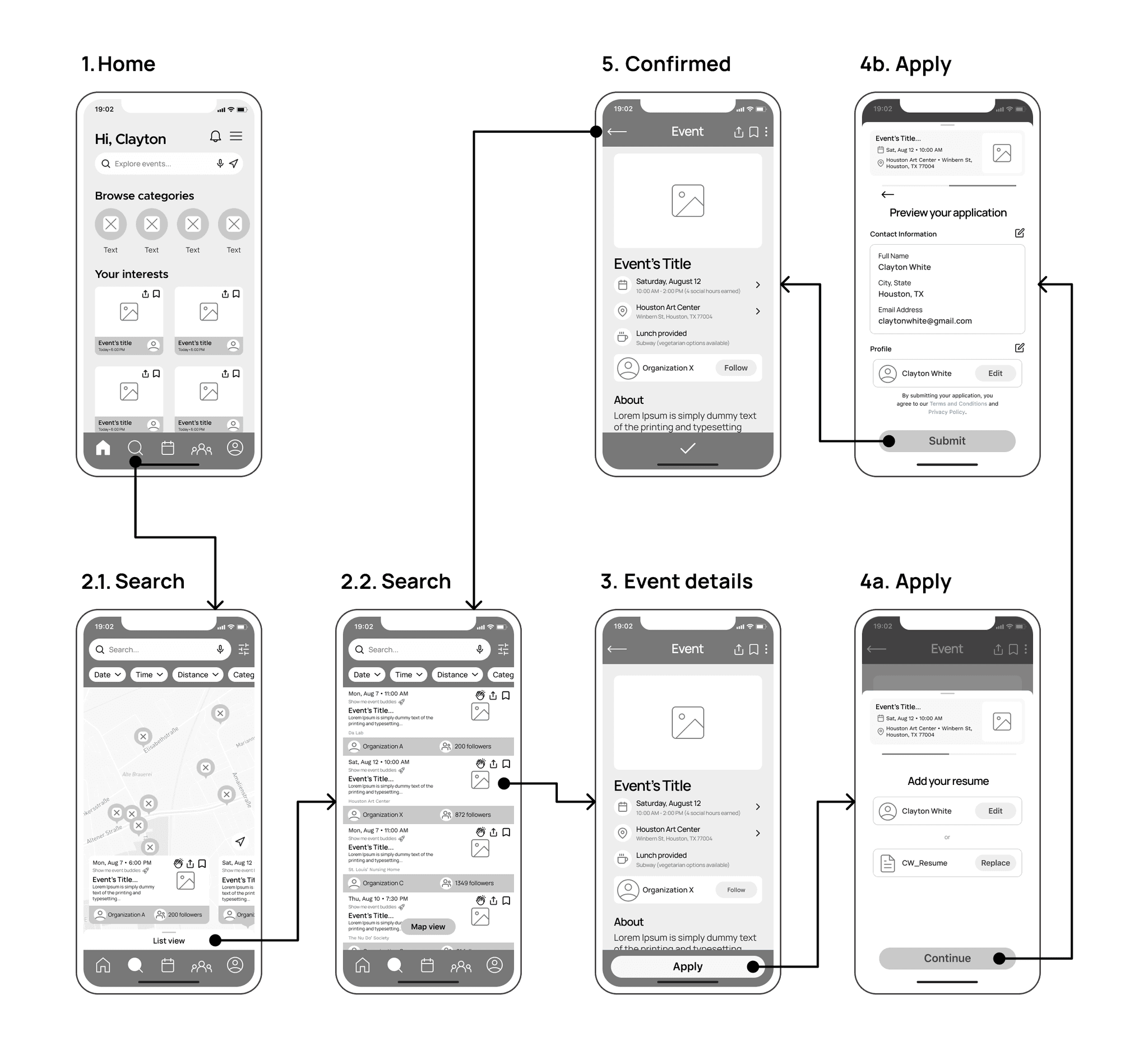
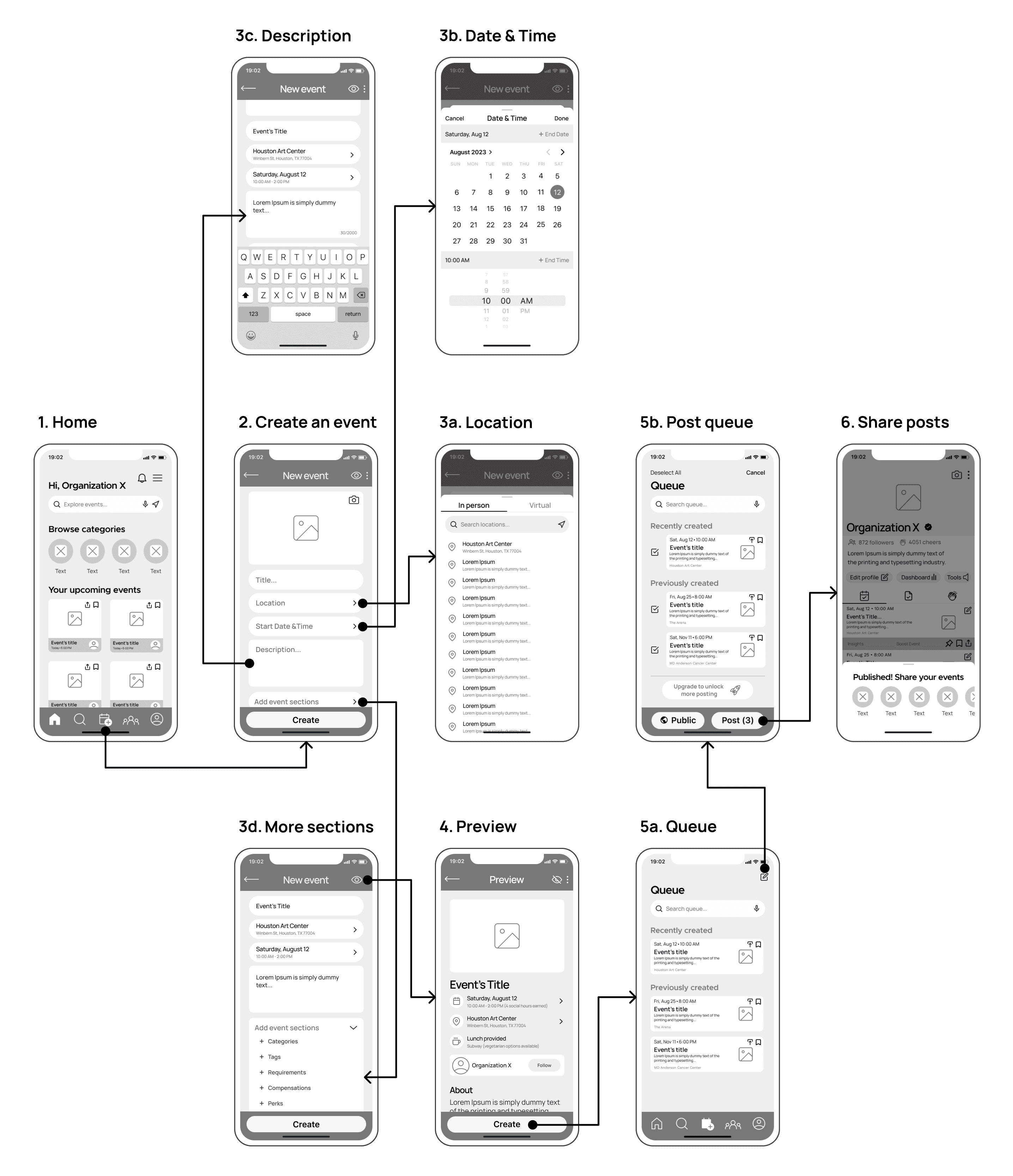
After creating the wireframes with iterations taken into account, I arranged them into wireflows to better communicate the user journeys and information architecture.
Search & Apply for an opportunity
Create & Post event(s)
Visual Identity & Style Guide
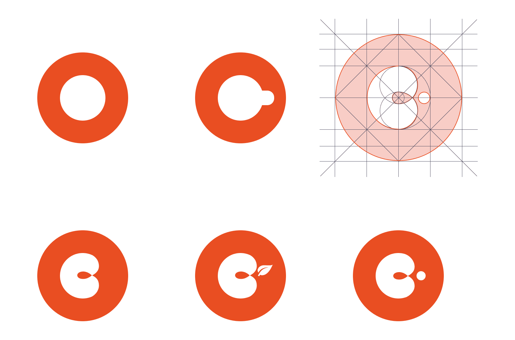
Logo Design
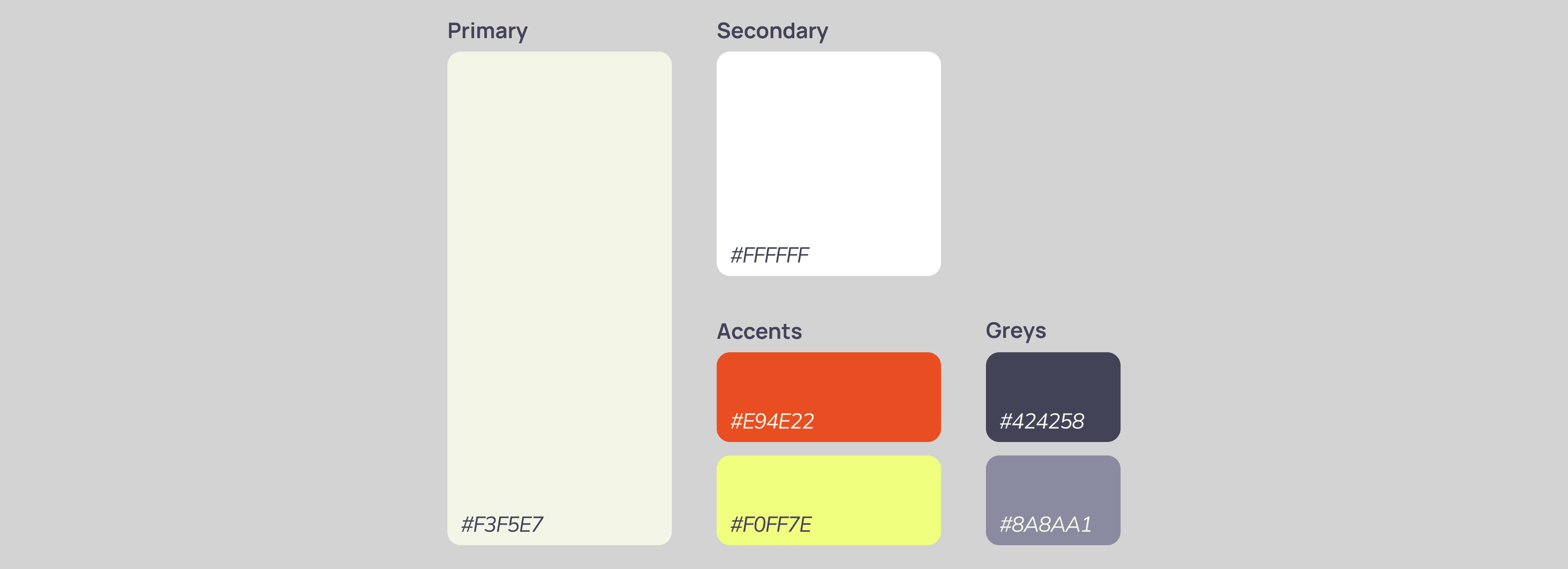
Brand Colors
Iconography
Regular state
#424258
Pressed state
#E94F22
Colors
Style
Home
Explore
Events
Community
Profile
Perks
Save
Share
Post
Location
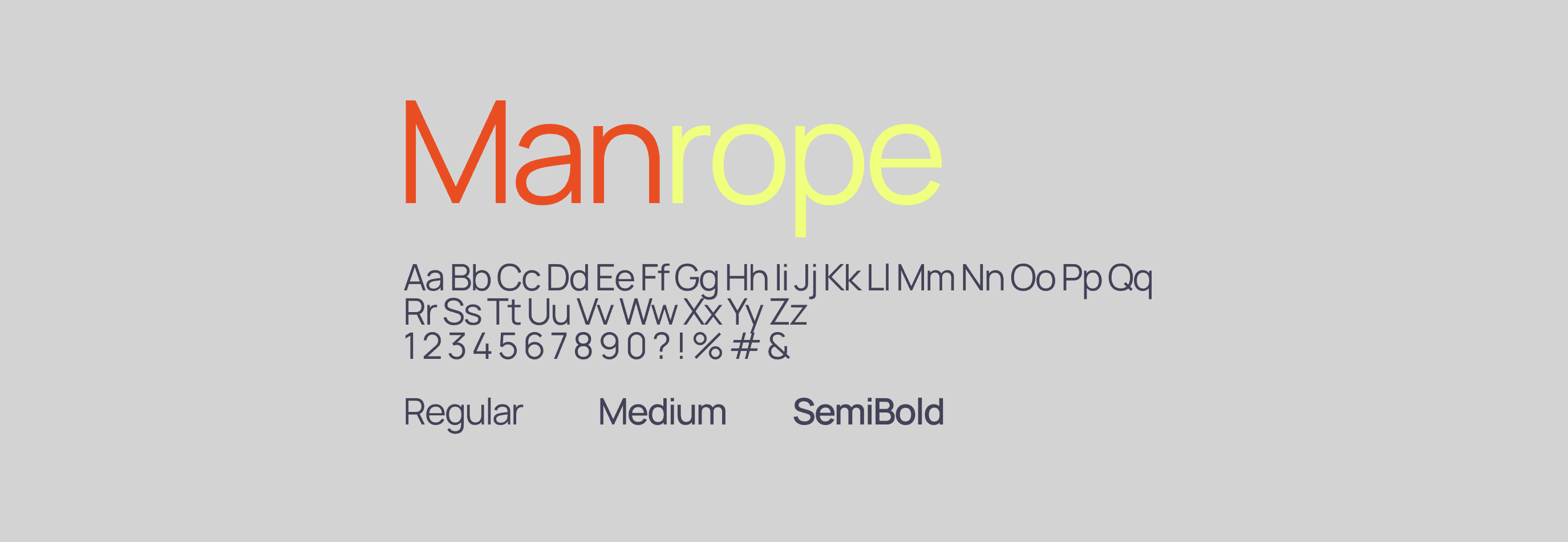
Typography
Accessibility Check
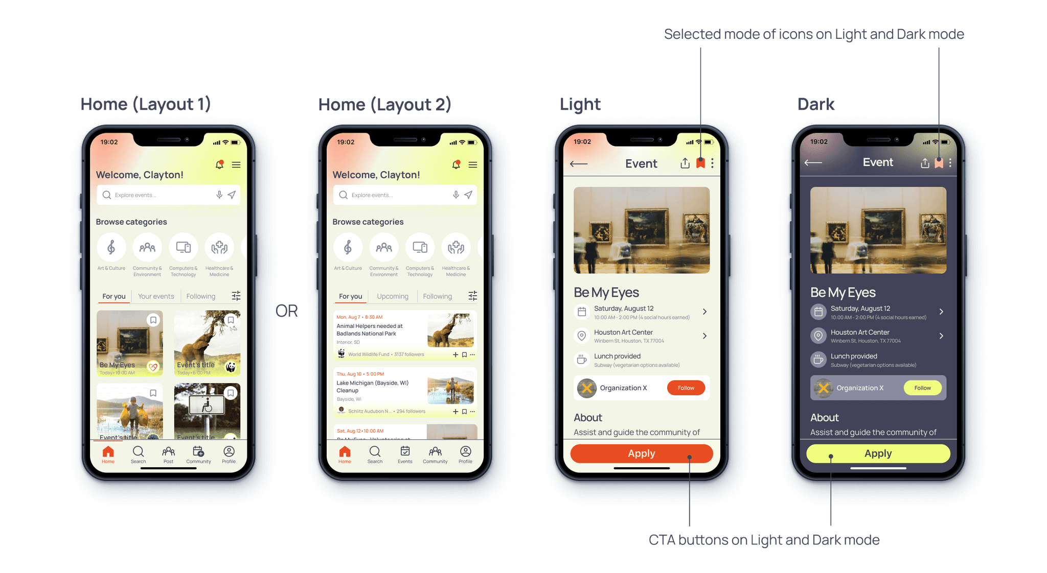
High-fidelity Prototypes
Try it out?
TEST, ITERATE, REPEAT
Usability Tests & Iterations
To prepare for the usability tests, I created a script of questions to guide the user testing sessions. Two rounds of moderated usability tests were conducted remotely, with 10 participants in total (5 people for each round), in which 7 of them self-identified as part of different volunteer communities.
The primary objectives were to assess how users interact with the prototype, which determines areas for improvement, as well as uncover any usability issues after iterations.
Here are my top three critical findings which appear to be the most common patterns performed or found by most of the participants, together with my iterations.
Confusion over Account Sign-up options and Verification process
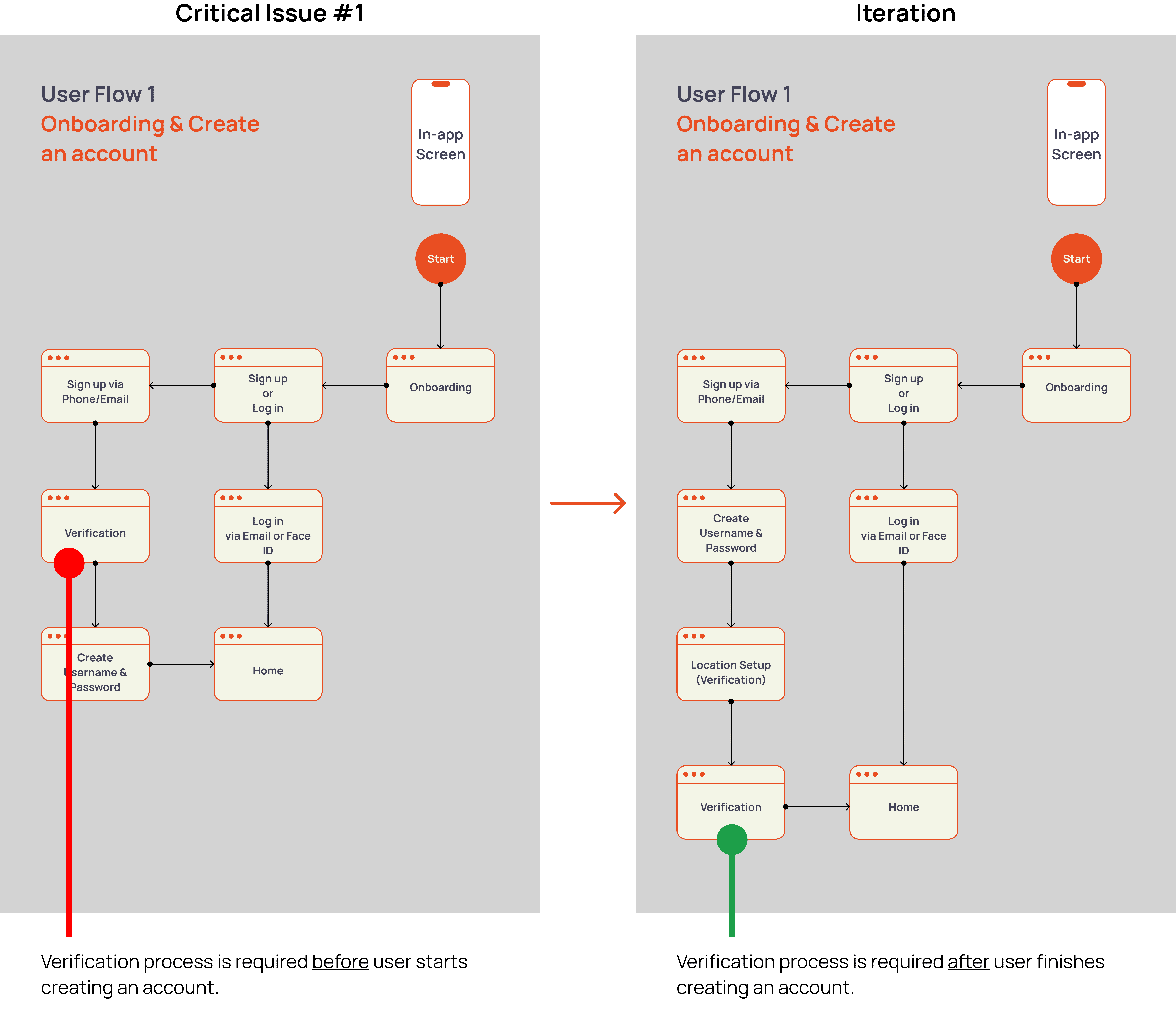
Was the redesign Successful?
✔ 100% completion rate on the 2nd round of Usability Testing
✔ 5/5 participants found more user control when Creating an Account
Confusion over two different Application options
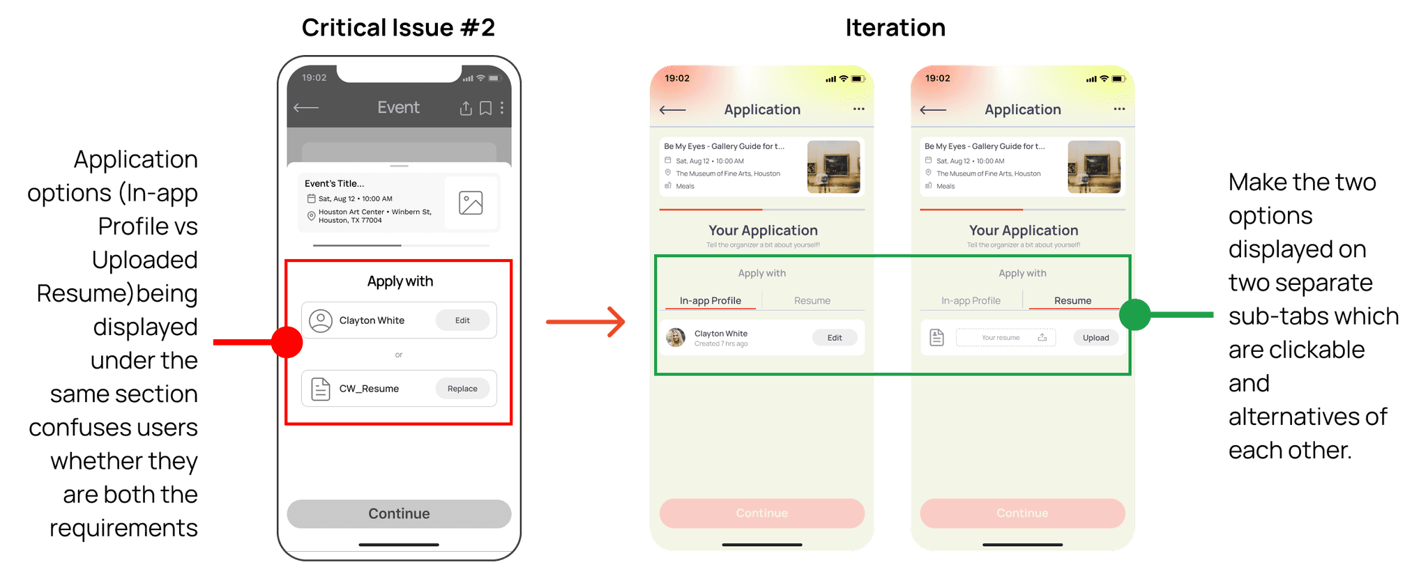
Was the redesign Successful?
✔ 100% completion rate on the 2nd round of Usability Testing
✔ 5/5 participants were able to tell two separate options of Application by appropriate wording and similar pattern recognition
Confusing/Misleading language
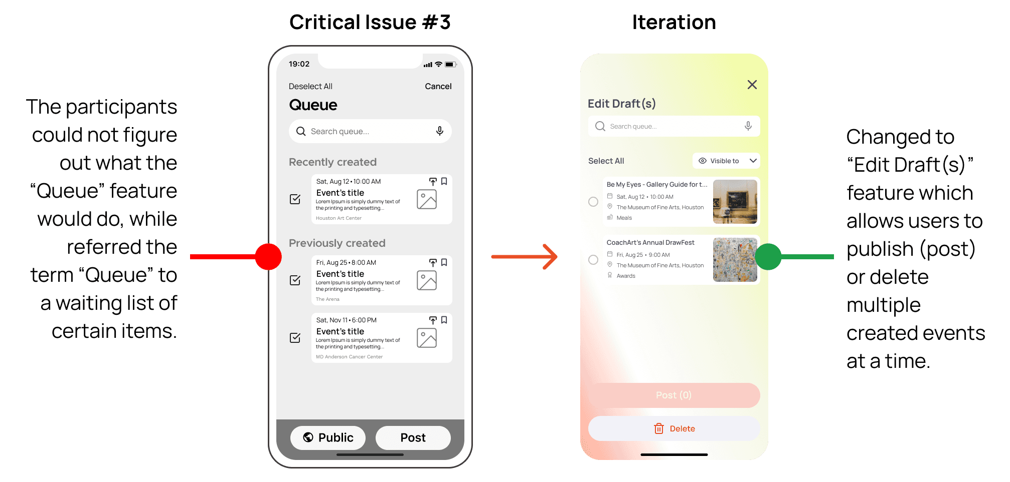
Was the redesign Successful?
✔ 80% completion rate on the 2nd round of Usability Testing
THE RESULT
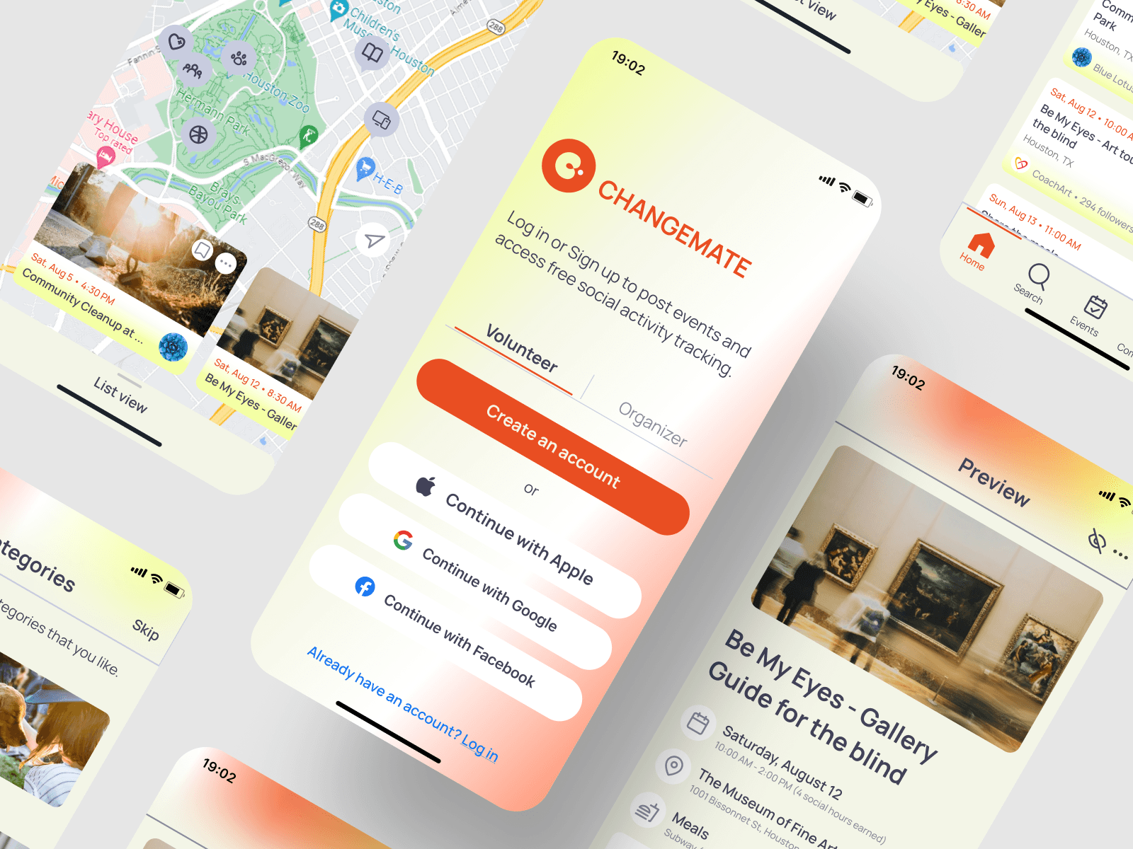
Landing page

THE VISION
Key takeaways
Throughout this solo project, I found the journey to be both immensely challenging and rewarding. It pushed me beyond my comfort zone, fostering a deeper understanding of the intricacies involved in creating meaningful user experiences.
At the project's onset, I held assumptions about user preferences that, through rigorous user research, were debunked. This taught me the significance of letting go of preconceived notions and truly immersing myself in the user's perspective.
One notable challenge was the unexpected resistance to a particular design element during usability testing. Initially disheartened, I realized this presented an invaluable opportunity to refine the experience based on user feedback. This iterative process became a cornerstone of the project's success, reinforcing the importance of adaptability in the ever-evolving field of UX design.
Depending on the scope of a project, collaboration also plays a pivotal role in most of modern design processes. Although I was basically designing in a silo for the entire time, I was able to reach out to one of my designer buddies for a quick brainstorming session during the iteration process. This has helped me realize being a UX designer, the sooner I get other people (including the developers, the stakeholders and other decision-making roles) involved with me in the product development phases, the better outcomes.
What's Next for CHANGEMATE?
Aside from higher fidelity, a promising phase of this project would almost certainly include streamlined user flows for activity gamification and in-app activity auto-tracking. My goal is to turn the experience for volunteer communities into activities that are as addictive as social media, yet as rewarding as productivity. Implementing this aspect can potentially bring additional business growth, and awareness to public opinion on volunteerism in general.
